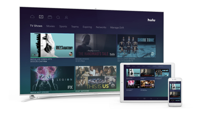
Hulu officially announced the launch of its live TV streaming service this morning at its Upfront presentation in New York, after earlier promising its “under $40” offering would arrive sometime this spring. The service — which is actually $39.99 per month — has a robust channel lineup, cloud DVR and combines Hulu’s existing on-demand library, including its Originals, with streaming TV and on-demand content from its broadcast partners. However, a key part to the new service is the revamped, redesigned Hulu experience.
Though Hulu’s new user interface made its debut at CES earlier this year, the company didn’t allow press to try the service for themselves at that time. Over the months since, a number of Hulu beta testers were allowed to demo the service and offer early feedback. But today’s launch is still considered a beta, as Hulu is continuing to tweak many of the details.
[gallery ids="1484779,1484789,1484788,1484787,1484786,1484785,1484784,1484783,1484782,1484781,1484780"]
At first glance, the service feels like a worthy upgrade from the existing Hulu app, which was starting to seem a little dated. The new interface instead has a mobile-first focus, with swipeable screens, larger imagery and (planned) support for push notification reminders and alerts.
But the devil is in the details, as they say.
Upgrading challenges
There are a couple of things to know if you’re interested in upgrading to the live TV service. For starters, it’s not yet available on every platform. At launch, you can stream Hulu’s live TV on Apple TV, Xbox One and Chromecast, as well as iOS and Android mobile devices. Support for other major platforms, including Roku, Amazon Fire TV/Fire TV Stick and Samsung Smart TVs, is coming soon.
I initially ran into another gotcha, too. I had subscribed to Hulu through my Roku, which prevented me from being able to upgrade to the new service. Until Roku is supported, the workaround would be to cancel your account, wait for the account to expire, then re-sign up. But that may take weeks as your account is not immediately switched off — you still have access through the billing cycle. (For the purposes of this review, I had to get help from Hulu.)
Onboarding
When you first sign into your Live TV account, Hulu will walk both existing customers and newcomers through an onboarding experience designed to customize Hulu to your preferences.
Here, users are prompted to import their existing WatchList if available, and then go through screens where they tell Hulu more about their interests. Some of the interest categories are broad — like Crime & Justice, Sci-Fi, Late Night, Action & Adventure, or News & Headlines — while others are more niche. For example, there are two categories for reality TV — one for celeb reality shows and the other for reality competition shows.
[gallery ids="1484809,1484807,1484806,1484805,1484804,1484803,1484802,1484801,1484800"]
You can also pick your favorite channels through the onboarding experience. I’m not sold on the idea that we should still be tracking favorite channels — after all, the new Hulu is supposed to be about following the content you like, not networks.
The app
The main Hulu app is organized into five main sections, accessible from the bottom of the screen: Home, My Stuff, Browse, Search and Profile (settings).
Home is where you kick-off your Hulu experience and is the company’s big bet on personalization. It’s not immediately obvious, but the section on your home screen called “Lineup” is meant to be a mix of the shows, movies and sports programming it knows you like (because you’ve favorited or watched) along with recommendations it thinks you’ll like. At first, this screen may have some misses, but the promise is that it will get better in time the more you use Hulu.

However, as many Hulu users have been conditioned to seek out and watch on-demand content, it may feel odd at first to start here with a screen designed for serendipitous discovery — especially when it’s getting things wrong.
As you move through the Home screen, you can dive into other sections, like “Continue Watching” to pick up where you left off, “My Channels” (which shows you what’s on now on your favorite stations), Sports, TV, Movies, Kids, News, Featured Movies, Hulu Originals and other suggested categories. In total, it’s 13 swipes to reach the end of the Home screen.
[gallery ids="1485036,1485034,1485035,1485033,1485032,1485031,1485030,1485029,1485028,1485027,1485026,1485025,1485024"]
Above: Flipping through Hulu’s Home screen
Unfortunately, you can’t customize this Home screen to remove any of the default categories here, which is a bummer if you’re not into sports or don’t have kids and don’t want to see these categories.
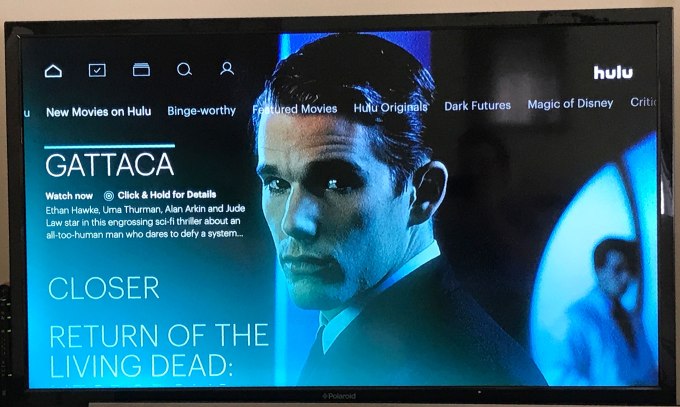
As you scroll further to the right, Hulu offers other suggestions of things you may like to watch. For now, Hulu is suggesting a lineup of shows under the “Dark Futures” category heading and another called “Magic of Disney.” The company says that these are editorial collections everyone sees at launch, but you’ll receive more personalized suggestions like this in time.
Mixing live and on demand
Hulu’s Home screen may work for people who don’t really have a show or movie in mind they want to see, and are just generally interested in finding something to watch right now. It blurs the line between live television and on demand — only marking its live TV content with a little green lightning bolt and the text “Watch Live.”

I’m not sure the average streaming service user arrives with the desire to first browse suggestions, though. Once you make the decision to ditch cable, you generally make watching TV a less passive experience. When you log onto a streaming service, you tend to first follow your favorites and then look for recommendations when you’ve binged your way past the shows you had been tracking and now want something new.
I’m also not fully convinced that combining favorites and recommendations across both live TV and on demand into a confusingly named “Lineup” makes sense. Granted, this is just my day-one gut reaction, but something about the Home screen feels wrong. I’m not sure if it would have been better to place your “My Stuff” into the Home section along with a “Watch Now” list of live TV recommendations, or if it just bugs me that “Lineup” is the place you start.
“Lineup” is basically Hulu thinking its recommendation technology is going to be so good that it’s the first thing you’ll want to see when you log in. But in reality, I’m coming to Hulu either for a specific piece of content, or — now — the desire to flip around live TV to see if something good is on.
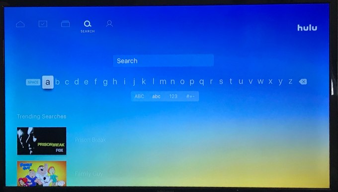
Finding content through the Search and Browse screens
The rest of Hulu’s interface is fairly self-explanatory — a Search screen helps you find channels, movies and shows, and see trending searches as before. The Browse screen lets you discover content by Networks, TV Shows, Movies, Originals, Kids, Sports or Genres.
It seems sort of odd that the categories Sports, TV Shows, Movies and Kids are in both “Browse” and “Home” — I think that’s overkill. Hulu seems to think people wouldn’t figure out how to find these high-level categories on their own, so it added them to the Home screen. But there it feels like clutter.
[gallery ids="1484992,1484989,1484988,1484987,1484986,1484984,1484983"]
Tracking sports teams
Though I’m not a huge sports fan myself, Hulu’s new interface does offer a handy way to track your favorite teams so you won’t miss their games. There’s a “Teams” section under “My Stuff,” but you can’t search and add those teams from this interface.
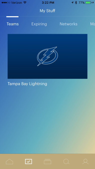
Instead, you have to search for the teams from the Search screen, tap onto a search result, then tap the plus (+) sign to add it to your Teams. Not ideal, but once it’s set up, you can follow your favorites through “My Stuff” at any time.
[gallery ids="1485015,1485013,1485012"]
Above: How to track a team
The idea with following your Teams is not only to make it easier to find the games you want to see when you tune into Hulu, but also to alert you to games that are about to start so you can tune in or record them. This will work with favorite TV shows, too. Unfortunately, push notifications are not available during the beta.
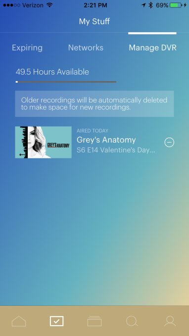
Cloud DVR
The implementation of the cloud DVR is also a little odd. You might have expected the DVR to have its own button at the bottom of the screen, but instead the “Manage DVR” section is the very last item on the “My Stuff” screen — you have to swipe more than six times to find it.
While you can play content from the DVR on this screen, it’s obvious Hulu doesn’t want you to.
Instead, the way you’re meant to use the DVR is not by going to a “DVR” section but rather by adding items to “My Stuff” via the plus (+) button. This is confusing because the plus is also the same button you use to favorite content for later viewing.
For example, if you tap the plus sign on a non-current TV series in Hulu’s library, that show will be added to “My Stuff,” but not create recordings. If you plus a current-season show, Hulu will record new episodes only.
Testing this feature on a show that has an on-demand library, syndicated re-runs and current airings (“Grey’s Anatomy”), I found that Hulu aggregated all the episodes it had in its library or was planning to air live.
You could then switch between seasons from the show’s Episodes page (Seasons 6-8 in re-runs or the current season 13). However, if you wanted to watch a particular syndicated re-run, you’d have to add that episode by adding it individually to “My Stuff.” For its current season, Hulu had all episodes on demand, and will add to this as new ones air on ABC.
[gallery ids="1484999,1485007,1485006"]
Above: How to record a re-run
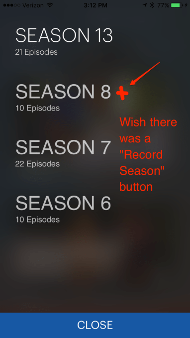
The way to record re-runs feels overly complex. While I understand that Hulu doesn’t want you to clog your DVR with re-runs for a show that’s still airing, it seems that it would be easier to allow those who do want to watch all the re-runs to simply tap a single button to add an entire back season to their “My Stuff.” (In other words, instead of tapping the individual re-run of a “Grey’s” episode on Lifetime, you could tap “Record Season.”)
This would be especially helpful for those who are working their way through a TV series, but are behind what’s live. Often, to get caught up on non-Netflix shows, you have to buy a season from Amazon Video or iTunes to see the episodes you missed. But if some of those back seasons are on Hulu, you could just record them and save your money.
Recording live TV
It was also not immediately obvious how to record a live program you’re watching now. According to Hulu’s documentation, you have to pause the show, then tap the plus sign. But in testing, there was no plus sign to tap! Instead, you have to first tap the “FLIPTRAY” button on the pause screen, and then you’ll see the option to add the show to “My Episodes.”

This seems, well, wrong. The recording option should be right on the pause screen, not hidden away underneath the FLIPTRAY button.
And secondly, I don’t know why things can’t just be labeled “record.” Given that Hulu is now a mix of on-demand streamable content and live TV, I think it should be more obvious and differentiated whether you’re favoriting something (to stream later on demand) or explicitly asking Hulu to use up your recording space to save a particular episode.
Hulu wants to blur this distinction, but I think that’s doing a disservice to users.
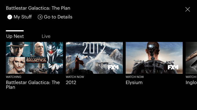
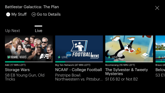
FLIPTRAY?
FLIPTRAY, by the way, feels even more experimental. It has two sections: “Up Next” and “Live.” When you’re watching a live TV show, you can think of “Up Next” as a guide to what’s going to air next on that channel. But when you’re watching on-demand content it seems to be a list of related suggestions. (You like “Battlestar Galactica?” Well, try “Elysium.”)
The “Live” section, meanwhile, is a scrollable list of what’s on now. The same list can be found under Browse –> Networks –> Live. (Because Hulu likes putting the same things in two places!)
Hulu has said that it wants to move away from people worrying about whether a show is on-demand or live — it’s all just TV — and some of its design decisions honor that vision. But putting a way to browse live TV right within the now playing window is like trying to remind users at every stopping point that, hey, we’re a live TV service! Watch now!
Still a beta
Hulu has definitely broken away from other streaming services — both on demand and live TV — with its new interface. But its Home screen experience could still be more personalized and feels misaligned with the way you browse the rest of Hulu’s app.
Today, the way you flip through content on Home is different from its other sections, which can be jarring. On Home, as you flip through the Lineup, TV Shows or Movies, etc., a show or movie’s imagery takes over the entire screen. It’s a more immersive experience, but it’s also a bit time-consuming to browse this way.
Meanwhile, all the other sections rely on more traditional thumbnails of the show, movie or channel, which lets it better utilize the screen space. It’s like Hulu wanted to try a new way to browse on mobile, but then couldn’t fully commit. (And to be honest, there’s a reason why all the other services go the thumbnail route: it’s efficient. Home is pretty, but definitely not speedy.)
Then there are the little tweaks — like the hidden record option or the option to tap once to add a season to your lineup — that could make Hulu easier to use.
And can we talk about this light font choice? It’s hard to see on the TV:
Finally, it remains to be seen if Hulu’s larger design decisions — like minimizing the DVR’s existence and recording functionality — will confuse users or make the service feel simpler in the long run.
Hulu’s live TV service is still in beta, so much could change between now and its public launch.