
Apple has a new version of OS X coming to Macs this fall, and for the first time ever, it’s giving up to 1 million members of the public the opportunity to test it out in advance – for free, and without requiring they register as a developer, starting this Thursday. The purpose of the advance feedback is to gather feedback and help test the release before its wider launch, and by opening it up to the public, Apple can likely get more input about how consumer-facing features are working than they would with a pool limited strictly to developers.
We’ve had some time with the pre-release build ahead of today’s launch, and our time spent with the next version of Apple’s desktop OS has proven one thing: Yosemite offers a host of great new features for users new to Mac and experienced Apple fans alike. Even the pre-launch build feels like a solid step-up from Mavericks, which bodes well for the finished result that should launch once Apple irons out the bugs and incorporates user feedback from its beta test program.
The Basics
Yosemite is a dramatic shift for OS X, and one of the most comprehensive overall changes for Apple’s desktop OS since its inception. The changes permeate the look and feel of the OS, and offer up a host of new features, with perhaps the most notable among those being the new Continuity features that corral iOS devices and Macs even closer together, with functionality flowing between the two on a number of tasks that make sense for both platforms to share seamlessly.
This initial public beta of Yosemite lets users focus on the other changes coming to the OS, however, as iOS 8 won’t be available to non-developers ahead of its official public launch sometime this fall. There’s plenty left to examine, however, as everything from notifications, to Safari, to Spotlight and everything in between has changed with this release, and almost all the changes represent a major step up from what came before.
Design
The new look of OS X with Yosemite borrows a bit from iOS 7’s flat, bold look, but it doesn’t break with tradition quite so dramatically. It does, however, borrow the penchant for transparency and translucency that Apple introduced to its mobile OS with the big redesign last year, and this is billed as something that has functional advantages, as well as aesthetic benefits. In practice, Apple has done design work that manages to both delight the eye, and make the process of using OS X more pleasant generally.
The new translucent look for individual app toolbars and sidebars let apps behind them show through, as well as your desktop if there’s nothing else present. This gives a pleasant sense of depth that extends the effect created by shadows in the existing version of OS X, and it also makes sure you have a better sense of where windows are on your desktop and what apps you’re working with, regardless of what else you may have open and without having to open Mission Control every five seconds. The Toolbars also take up less space, letting the app occupy more of your screen with usable workspace.
Apple’s new toolbars also put more functionality into the ‘traffic light’ red yellow and blue buttons found in the top left corner of every window. These include the standard close and minimize button, but the green button now defaults to putting apps into full-screen mode, and can still maximize a window with an Option click.
The font switch and the redesigned icons and dock that Apple has introduced with Yosemite also add to usability, as they seem much better suited to the high DPI displays you’ll find on the Retina MacBook Pro, while still retaining good looks and functionality on standard MacBook and iMac screens, too. The dock in particular, which features new icons for all of Apple’s default apps, looks excellent with a flatter look overall, while retaining familiarity for all the software you know and love.
Notifications, Widgets And Today
Notification Center on the Mac gets a lot more functional in Yosemite, since it gains much of the best to be found in Dashboard, but in a location that’s more convenient and that makes more sense. Apple is even calling the functions that you can add to the new Today view in Notification Center ‘Widgets,’ which is what they were called when they lived in the Dashboard, too. These can come from first- or third-party devs (Apple includes some widgets out of the box), and coding them for the desktop also prepares them for iOS 8 and the mobile Today view thanks to the introduction of Swift and Apple’s efforts with cross-platform development.
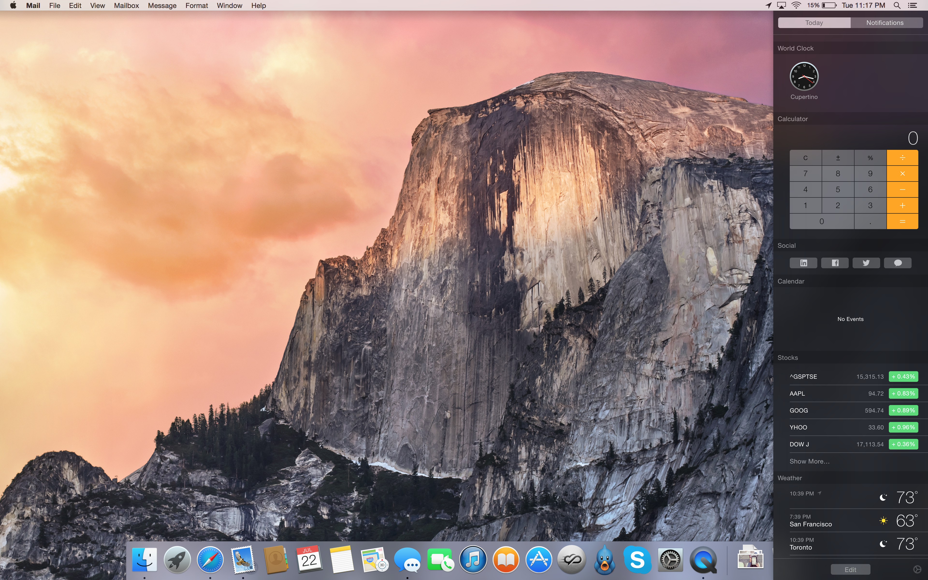
Widgets on the Today view can be rearranged or removed to your liking, and new third-party ones will be available in the Mac App Store both paid and free. In my testing, I was only able to play with a limited selection, but the ones that were there were handy and worked well. They also let me imagine how useful it’ll be when some of my favorite widgets from Dashboard, like Delivery Status, get moved to the Today view. Apple has kept Dashboard around for Yosemite, but once Today finds a home with users and developers, I wouldn’t anticipate it sticking around much longer.
Safari
With Safari on Yosemite, a lot has changed, and for the first time in a long time, I’m actually using it as my primary browser over Chrome. The Yosemite iteration of Safari offers a few benefits that make it a better browser than the competition, even at this early stage, and none of them even involve the hand-off features coming with iOS 8 that will allow the desktop browser to let mobile users continue their browsing uninterrupted.
The new sleek toolbar offers more website space in Safari, keeping all controls to a single row, and the new favorites view highlights websites you’re likely to visit as soon as you click on the URL/search bar, without any additional input required. The unified bar also works with Spotlight, calling up suggestions for your search terms from Wikipedia, Maps, and more, and while Google is still the default search option, Apple has added DuckDuckGo search with its default do-not track functionality. Safari also now uses native HTML5-based video playback for Netflix, which gives a major update to battery life when viewing the streaming service – up to two hours more than with the standard player.
All of which is great, but Safari’s new tab view is what I really love. Chrome can achieve something similar via extensions, but Safari’s ability to give you a look at all tabs at once, complete with nested grouping of tabs from the same website and snapshots of what was last loaded in each is a huge benefit when you’re working with a lot of them open at once, which I always am. Safari’s method of displaying tab titles, which shows you longer previews for fewer pages but lets you scroll through horizontally to see more, also ends up being a great feature, though it takes a little getting used to at first, since even when things get really busy you can actually stand a chance of figuring out what each open tab actually holds. It’s a big advantage for effective web browsing, and a sign that Apple is paying close attention to how browsing habits have evolved over time.
Spotlight
Apple has made Spotlight a star in Yosemite. They actually didn’t add all that much functionality to the already powerful system-wide search tool, but the new stuff is powerful, and the redesign of how it appears and operates on the desktop changes its role from supporting to central. If there’s one thing that will change about user behavior when they get their hands on Yosemite, in fact, I suspect it will be that they use Spotlight much more often.
The new feature now appears in the middle of the screen, with a big input window you can’t miss, and previews that feature rich media and full interactivity. It has hooks that browse web data sources including Wikipedia, Bing, Maps and others, as well as instant conversions for units of measurement, temperature, currency and more. It’s a launcher, yes, but Spotlight always has been one; now, however, more people will realize that it has that power – and the interactive previews add layers upon layers of additional convenience to its launch features.
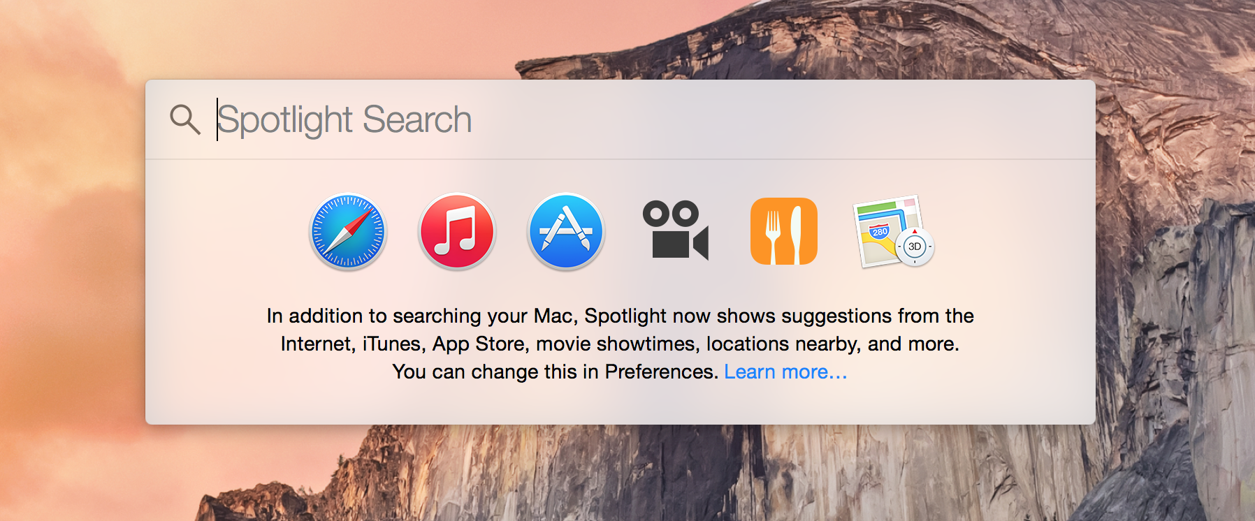
You can see showtimes for local movies in Spotlight now, too, and see trending results that provide contextually relevant links for what’s popular right now, provided through a new partnership with Microsoft’s Bing Search engine. As before, Spotlight can be called with a simple ‘Command+Spacebar’ key combination, but unlike before, this time you can’t miss it, and in fact you’d do well to learn its powers as soon as possible.
Messages
Apple’s redesigned Messages app in Yosemite brings it into the present – the older app had too many legacy attachments to iChat, both in terms of functionality and design. Messages now has a translucent side panel featuring all your conversations listed by recency, and you can now mute conversations, add new participants, and leave them entirely, right from the desktop app. You can also send short audio messages and playback ones you receive, as well as see a summary of all the photos that have been shared in your message chain so far.

The new Messages app feels like a full-fledged communication tool in Yosemite, whereas before it always felt a bit like a tacked on feature that wasn’t fully at home on the desktop. It’s already one of my most-used apps in OS X, but now, with these changes, it’s likely to become my primary digital communication hub – eclipsing email for important conversations.
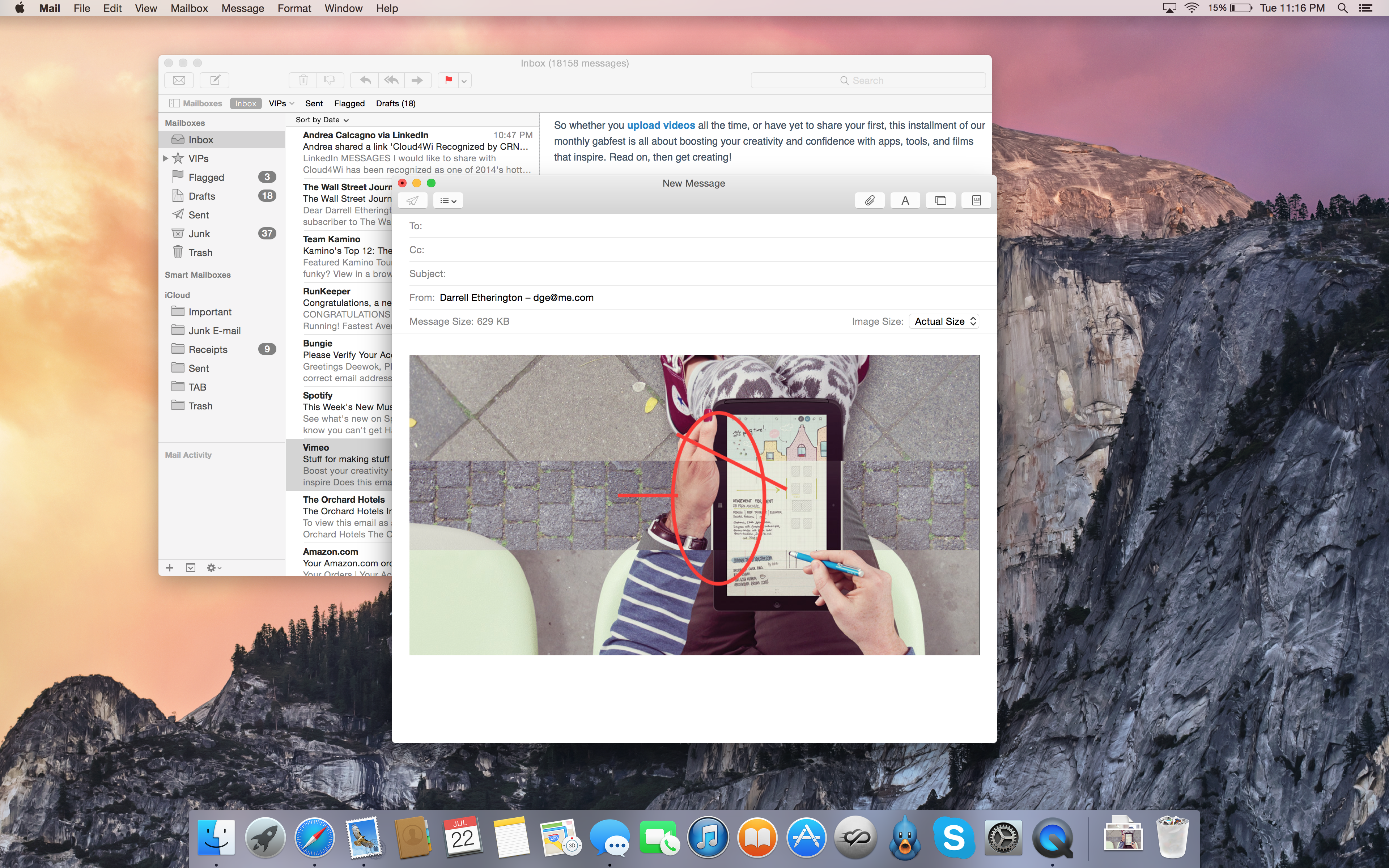
Even though I use messages a lot nowadays, Apple’s new Mail app in Yosemite gives collaborators a big boost. It makes it easy to share files up to 5GB free using Mail Drop, which uses iCloud to distribute the files rather than sending them directly, and it lets you markup attachments with annotations directly in the client.
This means you can use built-in tools like a magnifying loop, or auto-smoothing shapes for text bubbles, as well as sign documents directly in the message without having to roundtrip things to Preview or Adobe Acrobat. In fact, I foresee little reason to need to open either of those apps anymore, given that most of what I was doing with them was marking up PDFs to offer feedback to people I was working with.
Mail also gets better search, with improvements like automatically detecting and offering up corrected suggestions for name and subject word misspellings. It sounds like a small thing, but it makes navigating huge email archives a heck of a lot easier.
AirDrop
Apple has given AirDrop the ability to work between Mac and iOS devices, and to work across multiple versions of the various operating systems as well, which means that Yosemite can AirDrop with a range of existing devices. For sharing quickly without a shared network or Internet connection, this definitely beats the old “email yourself a document” method of passing things between devices.
iCloud Drive, Continuity and Handoff
A host of other features in OS X Yosemite involve cross-platform functionality with iOS 8, and so were only available for limited or no testing in this preview. These include the Continuity and Handoff features that will let you start writing emails on your iOS device and then finish them on the desktop, or browse web pages on your Mac and then pick it up on your iPad as you leave the house. iCloud Drive lets you see all the files you have saved for various applications, instead of keeping these siloed within the apps themselves, making it much easier to locate and manipulate them via Finder, and giving power users more control over something that Apple had previously made invisible. These all seem promising, but more information on how effective they are in practice will have to wait until iOS 8 launches properly.
If you’re going to participate in the beta beginning Thursday, it’s important to keep in mind that this is pre-release software, so some features are going to be buggy (using the coveted Dark theme in my build made Wi-Fi network names invisible unless moused over, for instance), so it’s probably best to only use it if you have a backup Mac. You should also back up the contents of your Mac before installing it, and remember that some features don’t work without iOS 8 on a companion device. Apple says it will be updating the Yosemite Beta periodically throughout the test, probably a little less often than the bleeding edge developer preview gets updated, and when the final build is launched, your Mac should update automatically. And remember that the whole point is to gather feedback, so use the included Feedback Assistant (a simplified version of the bug reporter tools from the dev preview) to sound off on any issues you encounter.
Apple’s first foray into consumer preview testing is coming out of the gate strong, based on my testing, but what’s most interesting is how the feedback of a million average users will inform the final product come fall. If it proves useful, I wouldn’t be surprised to see Apple trial the program with the rest of its software, too – including iOS.