This morning Nokia finally took the wraps off a long rumoured (and leaked) Android phone – unveiling a family of smartphones, called the Nokia X range, with the first three handsets being the Nokia X, X+ and XL, the first two with 4-inch displays, and the latter on the cusp of phablet territory with a 5-inch pane.
The Nokia X family forks Android, using the Android Open Source Project, in order to replace Google’s services with Nokia’s own, and with cloud offerings from the soon-to-be-parent of Nokia’s mobile making division, Microsoft.
“The Nokia X takes people to Microsoft’s cloud, not to Google’s cloud,” said Nokia’s Stephen Elop at today’s launch.
The strategy here is for Nokia X handsets to work as “feeder” devices — or, using another metaphor, as a gateway drug — to encourage users who are in the market for a low end smartphone today to upgrade to a full-fat Windows Phone-powered Nokia Lumia tomorrow.
To achieve this Nokia has brought together different elements from multiple platforms to make up the Nokia X, creating a mobile UI cocktail that’s one part-Android, one-part Windows Phone, with a sprinkling of Nokia’s Asha UI and even a philosophical dash of MeeGo/Maemo. Nokia’s Jussi Mäkinen told TechCrunch that the development team that’s been beavering away on Nokia X for the past year are especially excited to be working on an open source project again.
Yesterday, at Microsoft’s press event, the Windows Phone VP Joe Belfiore conceded that Microsoft’s mobile platform has “slightly more natural appeal in the low end” — owing to its relative lack of apps vs Android/iOS.
But the problem has been pushing the price-tag low enough to compete with budget Androids. The Nokia X family fixes that, with an initial price-point range of: $122, $136 and $150 for the X, X+ and XL respectively. (The entry-level Lumia, the Lumia 520, was announced at last year’s MWC with a price-tag of $180).
Expect the Nokia X family to be expanded to include even cheaper handsets, as Elop talked up the opportunity around sub-$100 phones, and also for Nokia to continue trying to squeeze the price of an entry-level Lumia even lower.
TechCrunch got hands on with the Nokia X handsets here at the Mobile World Congress in Barcelona. Read on for our first impressions.
Design
The Nokia X and X+ are the same handset on the surface, with the X+ having beefed up internal memory (and thus a higher price-tag). All three devices in the range have a clean look, with matte plastic casing that feels soft and smooth in the hand. Edges are squared off, with rounded corners and gently curving backs.
On the X and X+ the handset has a pleasingly chunky feel, while the XL takes the same design and stretches it so it’s bigger across the front but also thinner. The result is a large handset, that looks very bold — especially when painted in the bright orange colour variant — yet isn’t too heavy in the hand (which was a problem for Nokia with its early Lumia flagships).
As with the rest of Nokia’s handset portfolio, all the devices in the Nokia X family are offered in a choice of eye-popping colours — including a luminous green for the Nokia X/X+ (which came out more yellow in the shots below, thanks to the on-sight green lighting), and the aforementioned ‘high-vis jacket’ orange.
Cyan, yellow and red are also offered, along with white and black for people who want something more vanilla. All three handsets have user-removeable/replacement batteries, with the casing peeling off of the front of the phone to come away as a single piece.
The Nokia X/X+ is pictured in the gallery below.
[gallery ids="962557,962558,962559,962561,962562,962563,962564,962565,962566,962567,962568"]
Software
Hardware design is not the real story here. It’s the software that ushers in a new era for Nokia, being as the foundation layer for the Nokia X was not made in Espoo or Redmond but Mountain View.
That said, the Android Open Source Project that the Nokia X builds upon isn’t immediately obvious. And that’s absolutely the intention here. The new family of devices has a new interface, called the Nokia X software platform, that brings its own particular flavour.
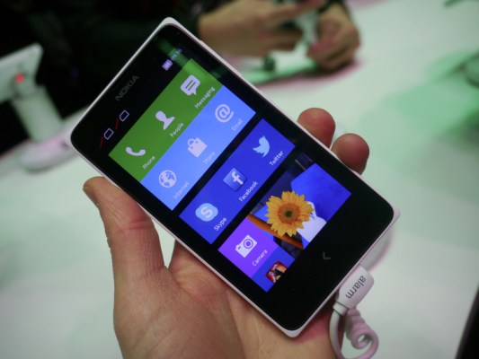
This is where Nokia’s mobile UI mixology comes into play, because the interface blends elements from multiple platforms. Most obviously the homescreen has a similar look to Windows Phone, with tile-esque objects rather than Android’s smaller icons.
These tiles aren’t identical to Windows Phone’s Live Tiles but are clearly close cousins. They also aren’t as dynamic, with relatively few changeable elements (at present) vs the Windows Phone-powered Lumia devices’ Live Tiles — however the larger gallery/pictures tile on the Nokia X does change to reflect the most recent photos you’ve snapped.
Scrolling down the homescreen brings more of your apps into view — and, on the demo handsets I was testing here at Mobile World Congress in Barcelona, this is where the Android element seeped most obviously into the experience, as more Android app icons started cropping up embedded on the tiles.
The design distinction between the third-party (Android) apps and the clean-looking white silhouettes of the native Nokia apps is obvious — and one way for Nokia to flag up/outline its own services here vs stuff that’s being piped in from the Android ecosystem.
Android apps are curated within the native Nokia store on the device (which takes the place of Google’s Play store), but can also be downloaded from various third-party Android app stores, such as the Yandex app store. If you’re looking for an app on the Nokia store and don’t find it, Nokia will return a link to another store where the app can be downloaded (if it’s available).
The Nokia X interface also incorporates an Android-style notifications tray up top — a flick gesture down from the top of the phone brings this into view. And there’s a parallel contextual bottom menu that can be pulled up at certain points within apps, such as the camera, which is apparently a borrowing from Nokia’s Asha UI.
Swipe gestures are also used to move between app screens/menus. While the only static button on the handset is a back button — a touch-key, rather than a physical button on all three devices — which sits at the bottom of the handset. Tapping this takes you back to the previous screen, or you can long press to land back on the homescreen.
The navigation is elegant and simple — I figured out the long press return to homescreen feature intuitively, for instance — although the demo devices I was trying out did have some trouble with the back feature sometimes. It’s not the final software build, however.
Beyond the homescreen, another big software addition here is Nokia’s FastLane feed — an alternative to the recent apps menu on Android. This is also something that Nokia first implemented on its Asha platform — and has now ported over (or up) to the Android-based Nokia X line.
FastLane provides a feed of activity that’s taking/taken place on the device and in the user’s digital surroundings, pumping in notifications about comments on photos you’ve posted to social networks like WhatsApp and Facebook, or showing a thumbnail of the latest picture you snapped with the phone. It also plugs into the calendar so future events in your schedule can be incorporated into the top of the stack too.
You can see FastLane pictured below, running on the larger Nokia XL device.
[gallery ids="962578,962577,962576,962575,962574,962573,962572,962571,962570,962566"]
FastLane provides a neat at-a-glance view — one which feels richer than a standard notifications tray, and does more than just offering a stack of recent apps.
Tapping on any event in the FastLane feed takes you back to the app/event in question so it’s a handy shortcut too. On the demo devices I was testing, the feed was fast and responsive, and certainly looked like it would provide a useful chronological overview of usage and social goings-on, all in one.
The information you see in FastLane can be configured, via a settings menu, so you can tweak which notifications, apps, social networks and device usage history appears in the feed. (Individual FastLane items don’t appear to be deletable via the feed interface itself, though).
The phone’s lockscreen also supports notifications, with a space for social missives to slot into view at the bottom portion of the screen. These can be swiped away to remove them.
Performance & verdict
It’s too early to fully gauge performance from a brief hands on with non-final build software, especially as several of the devices I was looked at lacked connectivity. That said, the Nokia X interface certainly looks promising. Mäkinen told TechCrunch that a core part of the work the Nokia X development team has been doing is optimizing Android so it can deliver a fast, smooth performance on more affordable hardware — and on that front there is certainly room for Nokia to improve on and outshine the budget Droidy hoards.
Android devices can certainly be very affordable — and at sub-$100 they are still more affordable than Nokia’s current Nokia X family — but the experience of very low end Android handset hardware can be very poor indeed (even Google itself complained about this, via its then mobile making arm Motorola, at the launch of the Moto G — a device also aiming to improve the performance of low end Android).
So Nokia’s strategy of pairing bold, colourful hardware design with performance optimized software that’s clean-looking, easy to use and also brings access to a large majority of Android apps, feels like a winner. The Nokia brand also still resonates strongly in many of the emerging markets where these handsets are going to be pushed hard — giving Nokia and Microsoft their best chance yet to recruit a new generation of loyal smartphone users by going where the growth is.