Facebook’s Home has been a bit of a flop, with few users willing to so drastically change the face of their phone. Today Facebook launched a redesign that makes Home more familiar to a traditional lockscreen by overlaying phone and Facebook notifications, a clock, and weather info on top of Cover Feed and giving users more customization options. The hope is by making Home seem like less of a shock, more users will adopt it.
The new version of Home went into testing with Facebook’s beta community in November but will become available to everyone in the Google Play store over the next hour or so.
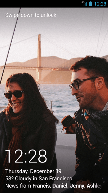
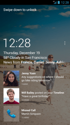
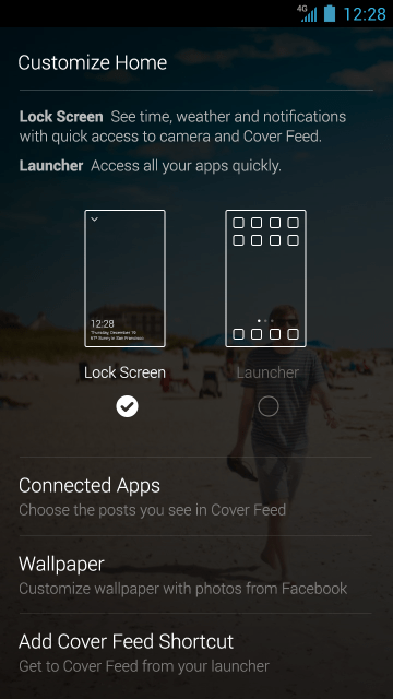
It shows time, weather, and notifications overlaid on your lockscreen for instant viewing. You can swipe left to view the Cover Feed of full-screen photos and posts. A shortcut to bring up Cover Feed has been added to the Home launcher, and you can choose a wallpaper as well. The update falls short of letting you add fully customizable widgets to your lockscreen like you can with other Android versions and downloadable lockscreens. Still, it makes Home less foreign, which is a step in the right direction if it wants more usage.
Here you can watch Facebook’s one minute demo of the new Home features.
 When Home launched in April, it basically steamrolled over your existing Android phone’s customization. There were no folders, no widgets, no dock of favorite apps. This made people feel like they had to sacrifice the phone experience they’d grown accustomed to live with Home, and many felt it wasn’t worth it. Traction was weak, and CEO Mark Zuckerberg has admitted he wasn’t full satisfied with how Home has progressed. As of now, it still only has between one million and five million downloads, while Facebook’s main Android app has well over 200 million active users.
I wrote in May how Facebook needed to make Home more of a social layer on top of your existing Android set-up rather than a replacement. By July Facebook had begun shifting in this direction by allowing you to customize a favorite apps dock, create folders, and crucially, import your existing folders.
Today’s redesign could be seen as an extension of this push to make Home more of a complement than a replacement for how you interact with your phone.
Since launching, Facebook has seen several new competitors enter the lockscreen and launcher market. Rather than a more one-dimensional experience around Facebook or another app, Cover and Aviate are contextual interfaces that try to show you the right apps at the right time, like your work apps while you’re at the office and your personal apps at…home. I wouldn’t be surprised to see Facebook acquire a startup in this space to bolster its lockscreen and launcher efforts.
Home promised an interface that put friends ahead of apps. But in reality, we use our phone for so many things beyond social networking that burying apps and widgets made Faceboo Home for of a roadblock. To make Home succeed, Facebook may need to retreat from its initial strategy, and find a compromise where friends and apps are loved equally, rather than making us play favorites.
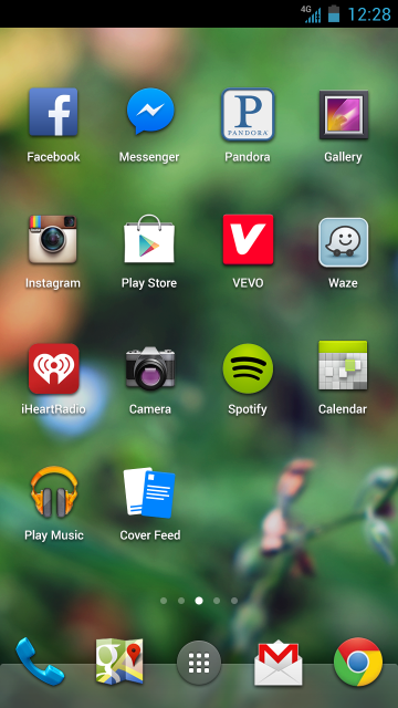
Screenshots of the new version of Home rolling out on Android today are below.