
In its rush towards becoming a public company, Twitter is in danger of sacrificing focus on the altar of growth. And it’s doing it with decisions based heavily on data and testing, rather than with an overall vision.
This week, Twitter shipped an update to its iOS, web and Android apps that features in-line image previews, a preponderance of action buttons and new tools for advertisers to caress your eyeballs. Over the past few months, the Twitter product has evolved haltingly, with missteps like the external #Music app that have turned attention inwards to the core offering.
It isn’t all bad. The speed and performance of Twitter have come a long way recently, both on Android and iOS; some of its experiments have paid off with useful new features. And the recent efforts to support emergency alert services are incredibly welcome, and a great way to leverage Twitter’s services.
But overall, Twitter’s product strategy is beginning to feel scattered and disjointed, and it lacks a real sense of coherent design oversight.
Multiple sources inside and outside the company have expressed to us that Twitter’s engineering and feature teams are frustrated by this approach. Twitter’s over-reliance on user testing in making decisions and a strong focus on ‘optimizing for growth’ over any other consideration is causing friction.
User testing, or a/b testing, is all about shipping changes or new features out to groups of people before making a decision about which to support. With apps, the power of this model is greatly expanded. Twitter is able to split off segments of its hundreds of millions of users into buckets that it can use to test engagement or interactions like button taps. The data is reviewed and a decision about a feature or change is made based on the success of one test or another.
This is a common practice at tech companies — some consider it absolutely indispensable to product development. But some of Twitter’s recent decisions point to an over-reliance on the results of this kind of testing to make choices.
There are dozens of detailed missives on the Internet about why this kind of testing should be interpreted with care, as even small changes in test parameters can sway results one way or another. From what we understand, the design decisions at Twitter are currently being made largely by data — especially if that data shows that a few more ounces of growth can be squeezed out of the apps.
To give you an idea of how much Twitter relies on this kind of testing — at one point it was possible to see two versions of the timeline on the same device on different accounts. We saw this in action in the wild, and in the images below, you can see the ‘old’ timeline and a test version of the one that shipped this week:
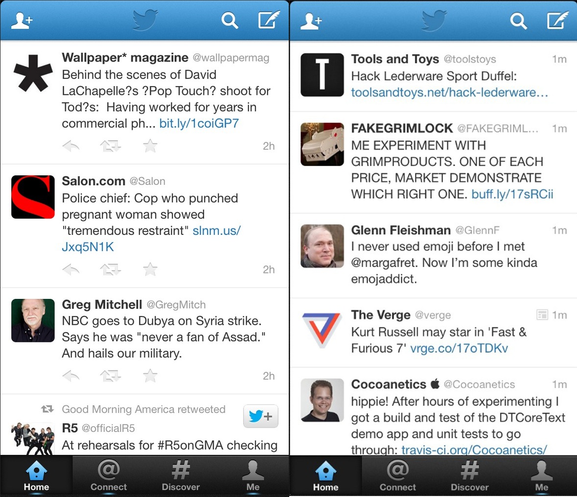
The timeline on the left was tested for a few weeks before the data pushed it towards shipping. You’ll notice the static interaction buttons on the screen. These, it’s fairly clear, were designed to lower the barrier of interaction for users on the platform. If the interaction buttons are right in the feed, more people will likely tap on them. Here’s what the timeline looks like now:

Unfortunately, this is a fairly awkward design decision, leading to a cluttered interface and likely just as many accidental taps as intentional ones. It may even have been those accidental taps that led to the data pushing this feature into the shipping version of the app. Frankly, it’s ugly, and one of the main reasons that it made it out of testing was the data showing that it could result in increased engagement.
Twitter’s expanded image timeline was also tested this way.
This is all exacerbated by the fact that the desktop version of the app is on its own evolutionary track. Modules are swapped and expanded, but it still looks and works much different from the mobile counterparts.
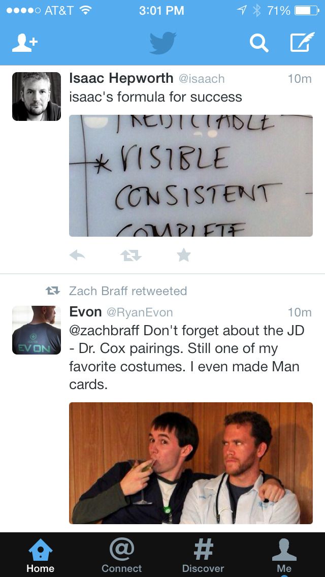
Over the past few weeks, several changes have been made to Twitter in the interest of pumping up user growth and ad-friendliness. Among those are the new conversation feature, which links tweets together with a blue line and pre-expanded timeline images.
With the conversation feature, Twitter trampled one of its own inviolate rules: Everything on Twitter is in reverse-chronological order. Now, replies to conversations cause the original tweets to bubble up in the timeline, knocking them out of order and contributing to chipping away at the core nature of Twitter. Conversations were implemented in order to increase the friendliness of Twitter to new users, but in the process they’re obscuring one of the things that was so good about the service, and may ironically confuse users more than help them.
Chronology has a simple, primal power and it’s always been part of what makes Twitter what it is. Screwing with that is exactly what happens when you follow your nose to growth rather than examine carefully what the impact of a feature is on the product.
Pre-expanded images pushes Twitter further toward Facebook’s inscrutable feed, with a stream of out-of-order visuals that can’t be opted out of on the web. And, more importantly, it homogenizes Twitter’s network in a way that makes it feel like every other feed.
Both of these features, especially when taken in aggregate, break the fundamental building blocks of Twitter, making it just one more scrollable column that looks like Facebook — just as Facebook is in the middle of efforts to attempt to make itself a place for real-time conversation like Twitter.
It’s not the pre-expanded images themselves that’s such a big deal; it’s the execution. On the iPhone, you’re looking at most of the screen swallowed up by one or two images, and on the web, maybe three or four. Yes, you can disable the inline images for now on mobile apps, but I’m not sure how long that will stay that way.
It damages the readability of Twitter in a huge way. Yes, every other social network and messaging platform out there is moving to the ‘stream of images’ model, but making Twitter like every other network isn’t going to be good in the long run. The power of Twitter lies in the fact that you’ve curated a stream of information that you want to read. It’s not — though Twitter would like to believe it — in the fact that you’ll soon be able to see every kind of movie clip and news brief and what have you in the feed.
It’s the commentary around those events and clips, and not the content itself, that makes Twitter what it is.
You can bend and twist the shape of networks in various ways to make room for advertising, engagement tweaks and new kinds of media, but eventually you’re going to break something. And Twitter — with its tighter, more focused stream — is very much in danger of doing that right now.
Those choices exemplify how nearly all of Twitter’s recent decisions about features are based on data from user testing. There is no overall design philosophy or endgame at work, and that lack of vision is hurting the look and usability of Twitter’s apps. They’re barreling full-speed down the road, attempting to keep engagement and growth numbers up without looking ahead to where they’re going to be.
And don’t even get me started on the Android or tablet apps. Fun fact — that Android tablet app released earlier this month? Built by Samsung, not Twitter (though Twitter has stated it will come to all Android tablets). So why hasn’t Twitter released its own definitive tablet update?
What we hear is that Twitter is in the midst of a months’-long slog toward fresh new release for phones and tablets. Some details of the new release, called ‘Highline,’ internally leaked out a few weeks ago — it may feature TV-related updates and a new swipeable interface. This week’s release wasn’t part of this plan, it was an update specifically to push out those ad-friendly expandable images.
The idea behind a swipeable interface is fairly easy to divine, as it could make the app friendly to multiple timelines. If these feeds could be treated as discreet items, Twitter could move beyond its ‘Home,’ ‘Connect’ and ‘Discover’ feeds to offer more specific feeds focused on things like TV. And, judging from how #Music went, that seems to be the way that it’s headed.
But Twitter’s development and design culture has contributed to frustrations at various levels during the project. Some components have been rebuilt several times only to get quashed at high levels because the testing numbers weren’t good enough.
As far as we understand it, the next release was originally much more ambitious, and set out a distinct vision for all of Twitter’s apps. But its forward edges have been blunted significantly by the process of test, poll and pull back that currently dominates Twitter’s product-development strategy.
The current direction of Twitter stands in stark contrast when compared to recent apps like Tweetbot 3. Yes, Tapbots charges a simple fee and is not a soon-to-be-billion-dollar-company. But its two-man team has managed to produce a cleaner, more focused mobile app in a few months than Twitter has been able to do with all of its resources. And people both inside and outside the company have noticed.
There are some situations where Twitter’s reliance on experiments has paid off with interesting stuff. See two recent user engagement initiatives: MagicRecs and EventParrot. Both utilities were launched as Twitter accounts first, that people could choose to follow and get notifications from via DM. MagicRecs has since been rolled into Twitter’s main product, and if EventParrot does well then it probably will, too.
But MagicRecs stands apart from other recent changes like the in-stream actions, conversation lines and pre-expanded images in that it’s about personalization, and doesn’t interfere with the main Twitter experience. The freedom given to run experiments and execute features based on those is incredibly important. Look to the way that Gmail resulted from Google’s ’20 percent time’ policy, or the fact that many of Twitter’s features were contributed by a community experimenting with the new service.
The rough part of this, for me, is that Twitter is trying very hard to be an independent profitable company, and that’s a good thing. I want Twitter to be around for a long time; I think it fulfills a role so vital that I’m not sure the Internet could do without it. And we hear that there are people inside Twitter who feel strongly about the organization’s need to make design choices rather than simply ones based on the data.
And that’s where Twitter will benefit focusing its efforts: on building a service with lasting usability and enjoyment. Short-term user growth and engagement hacking is the path that it has taken on the run-up to IPO in order to justify an asking price and have good numbers to tout in its S-1 and on the roadshow. But currently, the products across the web, Android, iPhone and iPad display a lack of clarity of vision.
They’re getting ugly, cluttered and confusing — and for little reason. Twitter itself is one of the clearest and most compelling sells in all of ‘social media.’ It’s a real-time feed of information from sources that you can interact with if you choose, or simply consume at your own pace. Releasing updates that don’t honor those powerful, simple tenets is a recipe for long-term disaster — no matter what the short-term gain.
At time of publish, Twitter had not responded to requests for comment.

Image Credit: Nicole/Flickr CC