After months of hype, questionable marketing spend, and 30 days of ‘meh’, Yahoo! has unveiled the next big move in its ambitious transformation: a slimmed down logo.
Honestly, the new logo reminds one a lot of fonts used in the 90’s, especially the stock beveled and glossy fonts that appeared on the internet portal GeoCities, where many of us first learned to build these funny things called ‘web pages’. Unfortunately, this is no longer the 90’s and this logo is feeling pretty dated.
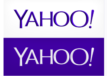
The logo is set in Optima, has had bevels applied, and is a flavour of purple called Pantone Violet C. It has a distinctly old-fashioned-internet vibe when it comes down to it. The slightly tilted exclamation point remains…an exclamation point. In case you’re wondering, it was tilted by exactly nine degrees. Many were hoping that it would go away, but Mayer had said a few weeks ago that it would stick around. One other thing retained is the slightly larger ‘O’ at the end of the logo. This has long been taken to be an onomatopoeic representation of the famous Yahoo ‘yodel’ from its commercials.
The old Yahoo logo, though dated in its own way, was also chock full of whimsy. The new emblem feels buttoned up and slimmed down. Perhaps the company is trying to project a tighter, more controlled image now. In that, at least, it may have succeeded.
In case you miss the new gif-based image in the top left corner of the screen, the playful exclamation point dances around the Y-A-H-O-O like a lost Pixar lamp looking for its home. Gifs are something Yahoo has heavily adopted since its acquisition of Tumblr, and is no doubt aimed at catching the sleep eyes of millions of netizens waking up to a brand new day.
In 2009, Yahoo shuttered GeoCities, which it had purchased ten years earlier. That was also the year that it picked purple as its new color. Though the logo is said to be a ‘nod’ to the company’s history, its original color of choice was red.
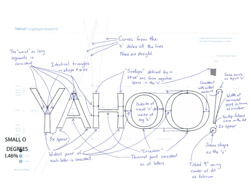 On her Tumblr, Mayer said she and the logo design team rolled up their sleeves one weekend this summer and weighed every detail of the new badge. They decided:
– No straight lines.
– Letters with thicker and thinner strokes, reflecting the subjective nature of Yahoo’s editorial.
– And a mathematical consistency, for coherency.
And of course “a pantone that needs no number and no introduction ;),” Mayer wrote.
“We knew we wanted a logo that reflected Yahoo – whimsical, yet sophisticated. Modern and fresh,” she wrote. “Having a human touch, personal. Proud.”
Aside from the fact that the logo had remained relatively unchanged since 1995 (when a seemingly unstoppable Microsoft prepared to transform the world of personal computing) she said that 87 percent of staff were demanding a new look, either iterative or radical.
The response on Twitter was underwhelming, to say the least.
Yahoo logo ranking right up there with Twitter’s blue lines.
— Jessica Guynn (@jguynn) September 5, 2013
If you’re interested in the learning more about the story behind this facelift, intern Max Ma has prepared a “fun and cool” video of its online makeover — replete with the tunes of Perth-based pop group Empire of The Sun.
Meanwhile, on Google.com, it’s business as usual.