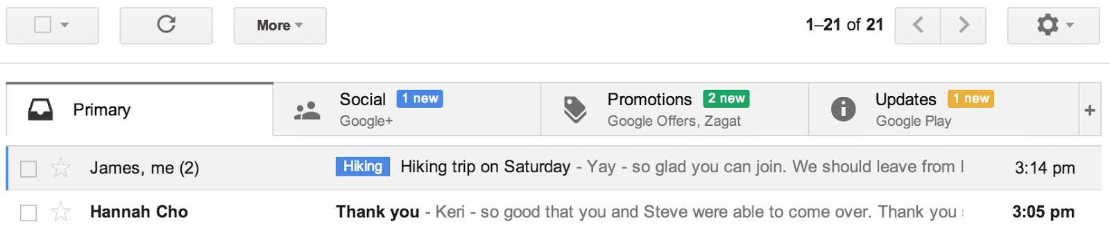
Google today is introducing a new way to manage your Gmail inbox. This new view of your inbox puts a number of tabs at the top of Gmail’s inbox column. By default, Google shows tabs – and automatically categorizes your messages into them – for your social updates from sites like Google+, Twitter, Facebook or YouTube, promotions from the likes of Google Offers and Groupon, and a kind of catch-all “Updates” tab for your bills, receipts and similar messages.
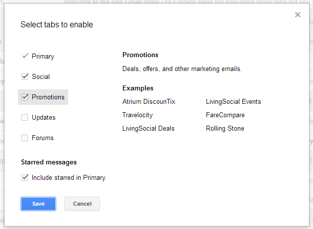
You can also add a tab for forum notifications which, at least in my test, also includes email lists. Google, of course, allows you to add or remove as many of these tabs as you want. To go back to the classic inbox, you just have to turn off all of the tabs or switch to another inbox style.
 This update, which will start rolling out for all Gmail users today, will be available on both the desktop and through Google’s mobile apps for iOS and Android, which should get an update early next week. As Google told me, this will be a gradual roll-out, so it may take a little bit before the new design appears in your inbox.
If you can’t wait, also keep an eye on the gear menu. Once “configure inbox” appears there, you will be able to turn this new feature on manually.
It’s worth noting that the tabbed interface doesn’t work with the Priority Inbox feature or any other non-default Gmail view. As Alex Gawley, Google’s product manager for Gmail, told me yesterday, the team believes that the new inbox is the best default for the majority of Gmail users. In the long run, both Priority Inbox and this new view could potentially work together in some form, but it’s not an option for now and Gawley didn’t have any ETA for when this could happen.
Gmail will, however, also expose these new categories in the sidebar, so you can still see your auto-sorted emails there.
Updated Mobile Apps
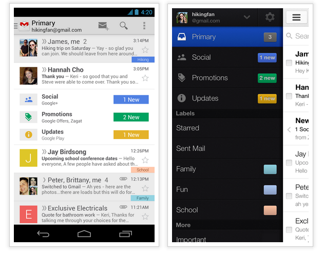
As Gawley stressed when I talked to him, it was important for the team to ensure that this new inbox view would be available on mobile as well, so both the iOS and Android apps will now show what Google calls “teasers” for updates in these tabs inside the regular inbox stream on these devices. These are basically notifications that there are updates available in these categories, but they don’t include the usual summaries, and multiple updates will just be bundled together into a single line.
With this update, Google is also introducing the recently leaked navigation drawer for the Android app, which now makes it easier to switch between categories than the “spinner” the company used in the previous design. By default, of course, the apps will always open on the “Primary” tab.
As Gawley told me, the main motivation behind this redesign was to figure out how to help users navigate the constant stream of new emails most of us have to handle today. What the team realized, he said, was that while Gmail added filters, Priority Inbox and more customization features, “your inbox started to feel like your master.” As users browse through messages, they are constantly switching context and that takes its toll as you handle a few dozen emails.
Google learned quite a bit from a similar Google Labs feature that also categorized and labeled emails automatically, he told me. The system will also learn as users move emails around to re-categorize them (you can drag and drop messages into the different categories by hand).