Apple just released its fiscal Q2 2013 earnings, and, as always, there’s plenty to dig into. In case you’re more of a visual learner (or just don’t have the time to read through multiple posts), take a peek at these charts to get a feel for how the folks in Cupertino did for themselves this time around. If you feel like learning a little more, clicking each of the charts will take you to a full post on the matter.
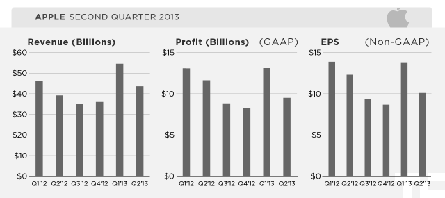
Apple managed to beat analyst expectations with $43.6 billion in revenue, and $9.5 billion in quarterly net profit.
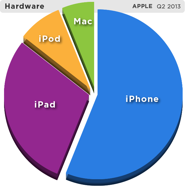
The company’s iPhone and iPad sales leaped year-over-year, but its Mac sales have remained flat.
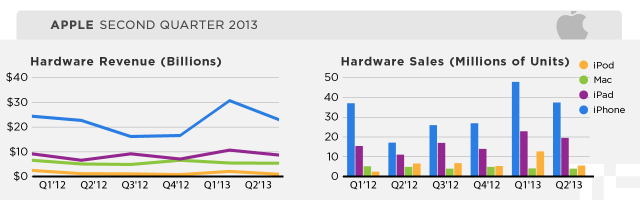
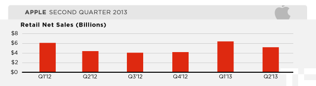
Apple’s retail arm reported a 19% year-over-year surge in sales.
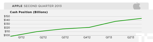
Meanwhile, the amount of Apple’s cash on hand has swelled to $145 billion — to put that in perspective, Facebook’s market cap is only about $62 billion.