Yahoo plans to start rolling out a new front page at Yahoo.com starting right now, with the goal of making the new experience available to everyone in the United States within two days.
I’m familiar with the front page but not a regular visitor, so when I saw the new design, I spotted a few changes from the old one — nothing too dramatic. Vice President of Product and Media Mike Kerns said Yahoo.com has a large audience (tens of millions of daily visitors) that’s used to the existing experience, so the team had a strike a balance between pushing things forward and making sure the page still feels familiar.
“We couldn’t go too radical, but we have introduced some meaningful new changes,” Kerns said.
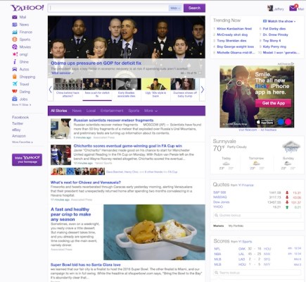
The biggest overall change is an increased emphasis on personalization. That’s something that the company has already been investing in, Kerns said, but the redesign pushes things further. (Personalization is also something that CEO Marissa Mayer has been emphasizing in her interviews about the company’s future.) A big part of the front page is the news feed of articles from around the web, and with the redesign, Yahoo is introducing a couple of ways to personalize the content — it starts out as a generic feed, but the site learns more about your interests based on what you click on, and the stories that get surfaced in your feed will start to adjust accordingly.
If you click frequently on the sports section, you should start seeing more sports stories in your feed. And visitors can give Yahoo more explicit feedback about what they’re interested in by hovering their cursor over the right side of each story, clicking on the X, and identifying a specific topic that they want to see less frequently. So when we checked out Kerns’ newsfeed, there was plenty of news about his favorite sports teams heading up a broader mix of content.
The feed has also been revamped by turning it into an infinite scroll experience, so that visitors can keep scrolling down and the feed will just refresh with new stories. Yahoo added a button for sharing stories via Facebook, Twitter, and email, too.
Beyond the newsfeed, Kerns says the company has added seven new applications to the right side of the screen. Design Director Jackie Goldberg said one of the goals behind the applications is to “surface the value that’s downstream” on other Yahoo sites. Put another way: They’re bringing more of the functionality of other Yahoo properties onto the front page. For example, until now, if you wanted to look up a stock price by ticker symbol, you would have had to visit the Yahoo Finance site. Now you can do that from the Yahoo front page, using the new Quotes app. There are other apps for things like viewing your Flickr photos and getting notified about your Facebook friends’ birthdays.
Most of the new functionality that I’m describing requires users to be logged in, either with a Yahoo account or with Facebook Connect (or both). Kerns said that’s already something a “significant” portion of front page visitors do, and he expects the number to go up thanks to the new features.
The last major redesign to the Yahoo front page came in 2009, and Kerns argued the changes are bigger this time around. There wasn’t any specific impetus to make the changes now, he said, just a general desire to introduce more controls and personalization.
Of course, this is also the first home page redesign since longtime Googler Marissa Mayer took over as CEO last summer. Kerns said Mayer was “very involved in this project, in many parts from the beginning.” So it’s natural to look at the redesign as a signpost for broader changes in Yahoo’s future. Again, the changes aren’t dramatic here (and I’m sure that will disappoint some people), but it does put Mayer’s talk about personalization into action in a fairly graceful and lightweight way. Kerns added that the team thinks of this as “a new foundation” to build “richer personalization experiences” in the future.
Mayer was “very involved in this project, in many parts from the beginning.”
It also suggests how mobile will continue to be integrated. Kerns said one of the goals was to “deliver the experience more consistently across three screens,” and the new home page is rolling out at the same time on desktops/laptops, smartphones, and tablets. When Kerns and Goldberg showed me the redesign yesterday, we tried it out on a laptop, an iPhone, and an iPad. The experience and design were all pretty similar (with some accommodations for touching and swiping on the smartphone and tablet) — so the idea was less about mobile as a separate category, and more as an integral part of the basic product.
Again, the changes here aren’t too radical, and the redesign probably won’t have a big effect on how most people look at Yahoo. But there are some nice touches here, and a sense that even if the products aren’t being shaken up dramatically, they are evolving.