Alexia’s Notes
AOL Palo Alto HQ — Redesign Meeting — Wednesday, January 16th, 2013:
There are a bunch of people in this meeting who I don’t know. I think they might work for TechCrunch. They don’t know who I am either. Half of the people in this room are sick, myself included. I’m going to go get a flu shot once this flu is over. Are you even allowed to do that? There’s a really funny Onion article on Twitter. There’s another really funny Onion article on Twitter.
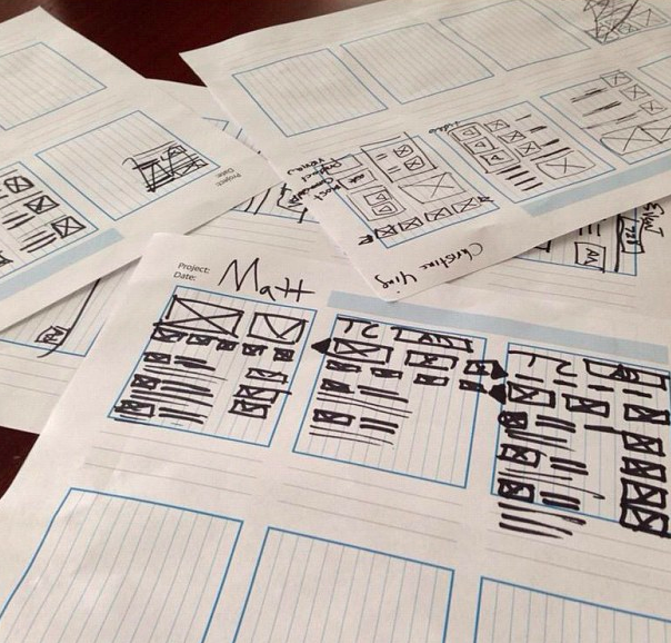
Now we’re being asked to draw boxes and circles and triangles to represent what we feel should be the future of the TechCrunch homepage. All my drawings are about boxes in boxes in boxes — and murder. Eldon has a new haircut. I think the TechCrunch homepage might be better if there were hearts on it in addition to circles and triangles and boxes. Also, Justin Timberlake. Timberlake makes everything look better. So modern and fresh and clean. Responsive.
I wonder if Tim Armstrong teleports in somewhere here when he comes to the West Coast (into the nap pods?). Beam me up, Arianna! Matt thinks we need to have a second screen experience for all Disrupt content. Something about “beautiful photos.” Why is it always “beautiful photos”? Never “just okay” photos. Most photos are honestly just okay.
I still think we should revert back to the old “classic” TechCrunch logo but just have Timberlake follow you around as you navigate the site. Also, not get the site flagged for Malware by Google randomly. That would be nice.
Fuck it, let’s just copy The Verge.