You scrolled right past the old design for Facebook’s “Pages You Might Like” mobile ads. Too much gray, not enough description. But they just got updated to show colorful banners and explain what a business does. Their designer Jeff Kanter thinks you’ll stop to give them a look. Maybe even a tap. With style and targeting, Facebook is turning limited mobile ad space into its secret weapon.
 As a product manager for the news feed ads team, Kanter’s job is to convey the messages of Facebook’s advertisers in a way that doesn’t interrupt the Facebook experience. To make sure he’s on the right track, Kanter tells me “we dogfood all these different ad experiences with employees first. We’ll give feedback, make tweaks, identify bugs, and then roll out a small external test.”
Next, Facebook watches to make sure they don’t anger the users. Kanter tells me “There are dedicated teams and people here who spend all day every day thinking about this, measuring sentiment and engagement carefully.”
Facebook only started showing ads on mobile in March, so it’s still figuring things out. “We’ve learned a lot this year and are continuing to learn. We’ve found that the news feed ads experience is pretty different from the right-column ads experience we’ve been working on for many years now, and we have already made a bunch of adjustments.”

Overall, the ads business is doing well, and Facebook is poised to rake in a ton of sales over the holidays. Facebook adtech developer Nanigans will be releasing data later today noting that the cost per click that advertisers paid Facebook over the Black Friday/Cyber Monday shopping weekend was up 25 percent compared to earlier in November, and ad rates are now twice as high as in 2010.
But the future hinges on mobile. Since Facebook’s IPO, everyone has been terrified that the shift to mobile would kill its ads business. Critics seem to be ignoring an important fact about the intersection of advertising and mobile design: If you have less room to show ads, each of those ads must be more eye-catching and relevant to the viewer.

Every web advertising company has to weather this same storm. However, Facebook has extraordinarily powerful ways to address these two needs that could keep it afloat while everyone else sinks.
First, Facebook has your friends’ names and faces. They’re inherently eye-catching. Second, it knows more about more people than practically any website or even government: your age, gender, location, interests, the device you use, the apps you play with, and who your friends are. That means if it can only show you one ad, it’s more likely to be for something you actually want.
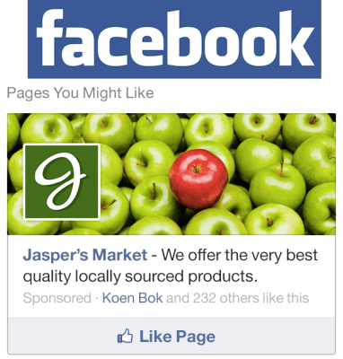
Kanter used both of these assets to make Facebook’s revamped “Pages You Might Like” ads better. Rather than suggesting three different businesses at a time, the new ad unit relies on Facebook’s targeting to show just one highly relevant Page. Beyond just showing the name of one friend who already Likes the Page, the ad shows the number of other people who Like it, providing a stronger peer recommendation. “If all these people Like it and so do my friends, maybe I will, too.”
Facebook has also improved the visual feel of the ads without burdening the advertiser by pulling in creative materials straight from the Page. Instead of just a tiny thumbnail of the Page’s profile picture, the ad takes its cover image and overlays a larger profile pic. Since covers are supposed to be big, beautiful images that generally represent a Page’s identity, they work well in the ads and can often give them a splash of color.
Finally, there’s a big “Like Page” button at the bottom to convert interest into a subscription. Kanter sums up how the new design makes much better use of a small space, saying “instead of showing three at a time, we show one with more context, and a more prominent call to action.”
 Personally, I think these ads look great. Those succulent green apples in the Jasper’s Market ad up top are much more eye catching than the old gray box or Jasper’s profile pic alone. Facebook recently launched a similar redesign of its mobile app install ads, featuring big banners and descriptions of what an app or game does to replace the low-content “Try These Apps” design that showed just a profile pic and an often cut-off blurb. Both of these new ad units are certainly more noticeable than the old ones, which should get more clicks (taps). Facebook just has to make sure they’re not so overt as to distracting from organic content.
Beyond these designs, Kanter tells me “We’re also testing a bunch of different features for mobile ads, including Page and app categories and descriptions, social context, headers, and more. Friends’ faces are currently used more on desktop…and though we’re not currently testing these outside of sponsored stories for mobile, it might be something we could consider in the future.”
Facebook is slowly transitioning into a mobile ad company. Fourteen percent of its ad revenue last quarter came from the small screen, and adtech startups tell me brands are lining up to buy mobile inventory. That’s pretty impressive since I think the old mobile ad designs weren’t very compelling. Now Wall Street finally seems confident enough to start betting on the future of Facebook’s mobile ad business, and this is what it will look like.