Foursquare, the app that lets people virtually “check in” to places that they physically visit, has debuted a new top-to-bottom redesign of its mobile applications. The new look does not come as much of a surprise — it has been whispered about quite loudly for days, in the tech media and perhaps most by the New York-based company itself. Now, it is finally live.
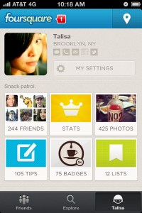
The new look is pretty clearly aimed at letting people interact more with others on the site — those that they know already, and people with whom they may not be acquainted yet. Each profile page features the user’s photo, location, short bio, and various contact information and social media profiles front-and-center. The home page’s new layout also makes it more inviting to click around to look at the latest activity by your friends. This seems pretty clearly built to make Foursquare’s experience “more sticky,” and encourage users to click around on it more often and for longer periods of time.
The new version of the app also more prominently features opinions on check-in locations that are penned by Foursquare users and also brought in from third-party sites. This seems to be aimed at giving users the incentive to spend more time reading the app, and also adds ammunition to Foursquare’s increasingly competitive stance against more review-oriented sites such as Yelp.
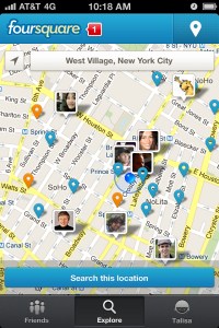
The location aspect of the app has gotten a new shine, with a snappier map interface that lets you see where your friends are in real-time.
It all looks quite spiffy, as it very well should considering the company’s clout: Foursquare has raised more than $71 million in venture capital since it was founded back in 2009, and its most recent stock sale valued the company at more than $600 million.
But that money comes with big pressures. It’s no secret that industry giants such as Facebook have gotten well into the check-in game themselves, and of course there is no shortage of local deals providers these days. The new look shows that Foursquare is up to the challenge of keeping its edge in the SoLoMo space that it helped to pioneer — the question is, will the “ton of revenue” Foursquare hasn’t started making yet finally follow? That, of course, is the $600 million question, and only time will tell.


