Just a few days ago, Pinterest rolled out redesigned profile pages. It wasn’t all that revolutionary — most of the profile navigation was moved to a header bar, title font for boards changed, boards themselves were transformed into featured image mosaics instead of thumbnail grids, and an “activity” feature was added.
The media (including myself) reported as expected. Pinterest is the darling of the tech world right now, and while no one said “this is the best redesign ever” within an article, the tone was generally optimistic in almost every explanation of the new profile pages.
But then came the comments.
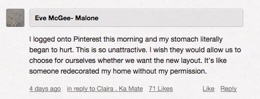
I won’t say that every instance of user feedback was negative. From what I’ve read, maybe one in every 20 or 30 comments was enthusiastic about the redesign (that’s just an estimate). Mashable has a poll claiming that of 866 respondents, 27 percent loved the new design and 25 percent abhor it, with the rest falling somewhere in “meh” territory. But just looking at comments, people were not happy. I’d say the designer responsible, Justin Edmund, probably hasn’t had the best few days.
Now, it’s worth noting that users often hate any type of redesign. You guys went ape-shit over the TC redesign, and you may even still hate it, but for the most part that aggression subsides as users grow accustomed. Most of the time that frustration comes from the need to relearn a service, but it can extend into ugly design, too. It seems that the general rage of users only subsides when it’s the former, and not the latter, that’s the problem.
According to the commentary, Pinterest is dealing with the latter. The site isn’t any more difficult to use. In fact, Pinterest is really good at making navigation of the site entirely obvious — likely part of the reason the site has grown so successful so quickly. The redesign maintains that, but also fundamentally changes the beauty of Pinterest.
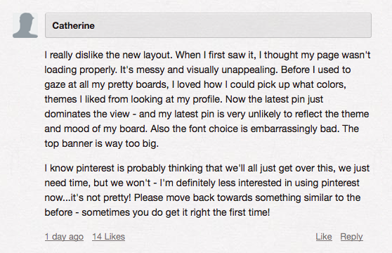
The biggest beef users seem to have is the inclusion of a featured image on boards. Users liked the grid, as it represented more of a theme than a single image, and many users spent a lot of time and energy (potentially more than an hour a day, according to comScore) curating their boards to be juuuuust right. The redesign effectively deletes that work and replaces it with a single (often cut-off) representative image with three small tiles at the bottom.
The frustration makes sense: do you want your most recent pin to represent that entire board? I don’t.
Another sore spot for users is the profile header bar. Many people think it’s a waste of space, as it forces users to scroll a bit before getting to the meat of a user’s boards. Not to mention, the old profile information wasn’t actually missing anything. Other aesthetic issues cropped up, with users noting too many different fonts, a lack of uniformity, and a generally cluttered appearance.
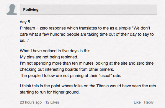
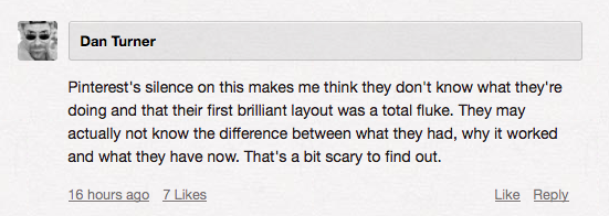
These are the sentiments expressed over the past few days, but in the last 48 hours or so, users are getting upset about something entirely different: Pinterest’s silence.
The company has said absolutely nothing about how users feel about the redesign, despite the fact that the Pinterest blog itself has over 400 comments, the majority of which are negative. Many are crying out for the option to choose between layouts.
It wasn’t broken, Pinterest. Why did you fix it? The service is still relatively young, even with its explosive growth, and it seems that the focus of the redesign went toward the most visually stimulating and attractive part of the site: boards.
Whether traffic is slowing or user interest is actually declining is still unknown, but Pinterest users sure have been loud about their displeasure. Hopefully, they’ll at least get the option to revert back, but Pinterest would actually have to respond before we’d know anything about that.
