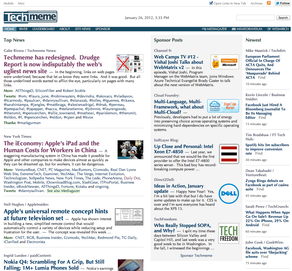
In a world of personalized, distributed information sharing, Techmeme and its sister sites have successfully gone the opposite direction. They’re machine-powered, human-controlled news aggregators that have readers — especially media types — following like drug addicts jonesing for another hit. The flagship site, Techmeme.com, has just gotten a big redesign that modernizes the look and feel of the interface, and emphasizes new social features. Here’s one junkie’s reaction.
The main aspects are the same as before. It still analyzes the web for popular articles, using factors like which article has the most inbound links, to provide an ever-shifting flow of top news. The stories are ranked according to popularity from top to bottom, with the input of its human editor team.
Almost everything else is different. It’s is the biggest change-up since the site looked like this back in 2006.
First off, links no longer have underlines, as founder Gabe Rivera says in his official post on the changes. This reflects a design preference seen on most of the web these days — except, as he notes on that old-school political news aggregator called the Drudge Report.
Perhaps more obviously for the casual user, the main feed of stories has had its width reduced by roughly 100 pixels by my count. Sponsored posts have been moved into a center column, which will appear above the fold on most computer screens. The feed of the newest stories has been moved to the far right.
“Sponsors weren’t complaining [about where they appeared on the site],” he tells me, “but I imagine some of them will like the new layout. One reason for three columns is it will make more room for other things near the top of the page. There’s space for ‘future expansion’. And yes, we’re not done filling that white space.”
Conversations, the collection of other stories under each main one, also has a convenient new dropdown feature — a downward arrow button that you can click on to see the extended list of articles. In the previous design, you could also do this, but you had to mouse over the story to get a small “+” button to appear for you to click on.
 On the social side of things, the site is making sharing even easier by adding Twitter retweet and Facebook Like buttons at the top right of each main story. Mouse over any one of them and the buttons will appear, as well as an additional one that lets you quickly grab a unique URL for the story. The previous design had packaged all of the sharing options into a window you opened via clicking on the story icon.
“In most cases readers don’t want to bother editing the headline of the story they’re sharing,” Rivera says about the choice of the Retweet button in his post, “so we opted for the more natural retweet option.” I followed up by asking what sort of sharing stats he had available. “Now that you asked,” he replied, “I realize I haven’t done any testing or research at all to support going with a RT button. It just seemed like a cool idea. I suspect you don’t see these buttons much because, unless I’m missing something, it’s a little harder to implement (because your site needs to grab the tweet ID after you post to make the button work).”
I asked him about the lack of Google’s +1 button. “Well, we’re open to it, but just want to begin with a simple trio of buttons.”
![]() A few other changes include a toggle button at the top to open all links as new tabs, a new About section, and new locations for links to sister sites, the archives, etc.
A few other changes include a toggle button at the top to open all links as new tabs, a new About section, and new locations for links to sister sites, the archives, etc.
Most of the reactions so far have been positive, but some readers are wondering about the new Optima font. Rivera has a good explanation. “Optima (the font people see on Macs and iOS) is very good at allowing the eye to see the different pub names in “More” (formerly “Discussion”) as distinct. Also, it’s the font most people I spoke to preferred when presented with a few alternatives before launch. But indeed, I noticed some people dislike it. Maybe it’s a divisive font. But don’t assume the haters are the majority. See also.”
The new interface will eventually roll out to Mediagazer and other Techmeme sister sites, like gossip aggregator WeSmirch and my secret favorite, Drudge-replacing political aggregator Memorandum. But the refresh isn’t as urgent, Rivera says in his post. “Mediagazer in particular isn’t as afflicted with the uglies in the first place, given that its area of coverage leads to less link-heavy story clusters. But it will nonetheless benefit from a refresh. Techmeme’s redesign will not, however, extend into its past. One curious yet fun practice we’ve upheld here is that old archives maintain their old look.”
Rivera’s response when I asked about what to expect from the privately-held, boostrapped company in the future? “We’re going to do more stuff.” Prepare yourselves, addicts.
[H/t to Miguel Rios for the headline.]

