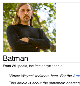
You know, I’m becoming something of a fan of Brandon Harris (the latest face of Wikipedia’s fundraising efforts, which you should absolutely donate to.)
First, he’s a programmer on Wikipedia, which is pretty much the most world-bettering programming gig you could ever have. Second, he stopped in for hugs even as we were sort of poking fun at him. Third, he’s taken the time to answer the question we’ve been asking for over a week now: what’s up with the crazy confusing/hilarious donation plea portrait placement?*
The answer: They do it intentionally. Because it works.
Harris answers the question (and a ton of others) in a rather wonderful reddit AMA (Ask-Me-Anything):
Were your and Jimmy’s portraits placed like that (directly above the article subject) intentionally?
It’s intentional, but I don’t believe it was actually designed that way from the start. There have been many experiments over time as to the optimal position of the photos, and it just so happens that the left side is where it’s got to be.
The folks at Wikipedia are kings of A/B testing, and it turns out that this positioning just works best. While it may cause an eye twitch for the UX designers of the world — and everyone who likes to pretend that they’re UX designers (i.e. the entire Internet) — it means more cash for Wikipedia in the end.
Plus: intentionally or not, it’s had an awesomely viral effect for the whole campaign (hence this post.) Now go donate.
* And finally, just look at that hair.