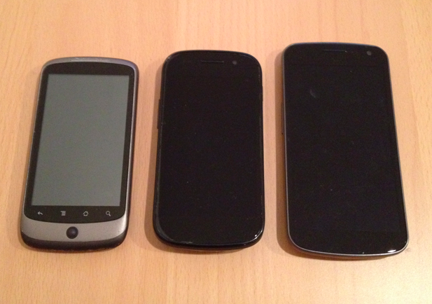
The Galaxy Nexus is big.
There, we’ve got that out of the way (don’t worry, we’ll revisit it shortly). Now onto the more important news: Ice Cream Sandwich, the new version of Android that ships on the Galaxy Nexus, represents a big step in the right direction: it’s making Android, which has long been faulted for being more confusing than iOS, significantly easier to use.
I received my loaner Galaxy Nexus from Google around twenty four hours ago (seven of which I spent in blissful slumber), so this post can’t be considered a review. Rather, think of it as my early impressions. I know what’s new, and I think I know which changes I like, but I’m still in the honeymoon-slash-‘Why is this different?!’ phase. With that said, let’s get to it.
As I noted before, one of the big themes in ICS, which is both perfectly understandable and mildly frustrating at times, is a push to make Android easier to use for people who aren’t ‘power users’. Some buttons have vanished. Others have been made more readily visible. And for the most part, Google has achieved its goal.
The biggest changes involve navigation. Since Android first launched on the G1, nearly all devices have featured four dedicated buttons beneath the screen: Back, Home, Menu, and Search. They had a learning curve (it took a while, for example, to figure out that if an option you wanted wasn’t immediately visible, it was probably tucked away under the Menu button). But once you got the hang of them, they worked.
Unfortunately many people never did figure them out.
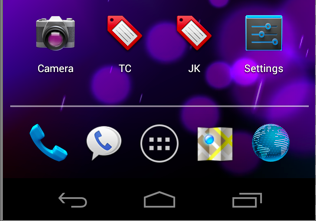
And so Google has done away with two of the buttons entirely: both the Search and Menu buttons have been removed, and have been replaced with an app switcher button. This change first appeared in Honeycomb, but because Honeycomb was for tablets only, it felt like more of a blank UX slate. Now that the change is on phones, it’s much more apparent.
My first reaction to the three-button layout: it drove me nuts. I’ve long since become accustomed to hitting Android’s dedicated Search button — especially because you could previously launch Android’s handy voice search and Voice Actions by holding down the button for a second or two, no matter which app you were using.
No more. Now the only way to launch voice search is to go to one of your home screens and tap on the microphone that’s shown in the (now unmovable) Google Search widget.
Google’s logic behind the change makes sense though. The old, four-button system could be confusing because it wasn’t consistent: two of the buttons, Home and Back, applied to systemwide navigation. Two of them, Search and Menu, were relevant to the application you were looking at.
Google says that according to user studies, many people never really understood what the search button was for, much less what long-pressing it would do. This was especially bad because many applications won’t show a search bar until you hit the search button — which is logical, but becomes problematic when peope don’t know they’re supposed to hit the button in the first place. Similar rationale explains why the dedicated Menu button has been eliminated: people didn’t know when to hit it, and so they would oftentimes miss out on key features.
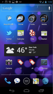
Of course, now that those two buttons are gone, Android has to find another way to surface those options. The solution is called the Action Bar, which, again, was first introduced in Honeycomb. 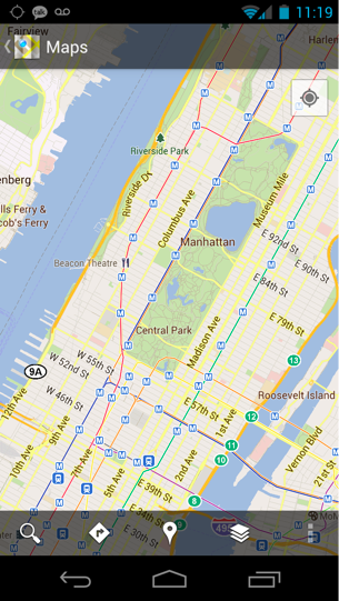
If you’ve used iOS before, the Action Bar will make you feel right at home. In short, it’s a mostly-consistent way for apps to surface features and to help you navigate between screens. Open the Maps app and you’ll see an Action Bar at the bottom of the screen with icons for Search, Directions, Places, and Map Layers. In other words, you don’t really have to go looking for anything anymore — the core features are just there.
Of course, some applications offer more features than can easily be shown on screen at once. Google’s solution to this is a new icon that consists of three small, vertically aligned squares. Tap it, and you’ll typically see advanced options and settings. This three-square icon does essentially the same thing as the dedicated Menu button did before, but it’s easier to find because it’s always shown onscreen somewhere.
It’s also more apparent that the new menu button belongs to the application you’re looking at, as opposed to some kind of system-wide Menu that people may have mistakenly associated with the old hardware button.
Aside from the ommited Search button, which I miss simply because it makes my beloved voice control harder to get to, this new setup feels like a huge step in the right direction. Most people are going to be excited about Ice Cream Sandwich’s more flashy features, but this is a fundamental and important change that is going to make Android easier to use for a lot of people — which is why I’ve spent so many words on it.
Oh, and if you’re a search-button-loving power-user like me, don’t get too riled up — you’ll doubtless be able to install a custom launcher app in the near future that’ll let you tweak these three main nav buttons to your heart’s content.
Okay, time for the fun stuff.
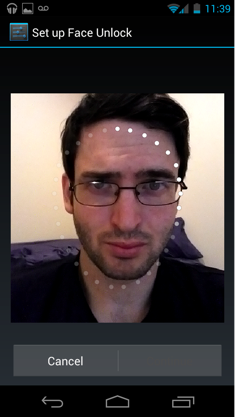 One of the highly-touted features in ICS is a new phone locking mechanism that uses face detection — simply point the phone’s front-facing camera at your face and it’ll unlock, without you having to bother with entering a PIN or onscreen pattern.
It’s definitely nifty, but you’re actually warned during setup that someone who looks like you might be able to unlock your phone, and there are videos on YouTube of people unlocking it with photos of people. So what’s the point?
Google acknowledges that there are other, more secure ways to lock your phone. But there are many, many people who don’t use any kind of PIN or pattern lock at all because they’re tedious to enter. These are the people that Face Unlock is catering to. Once it’s set up, it typically takes zero effort (the face detection works well in normal lighting, though it can’t handle dark rooms). And the reality is that if you lose your phone somewhere, there’s a good chance that the person who finds it will have no idea what you look like, anyway.
Is this something you’re going to want to use if you traffic in confidential information or scandalous texting? Not at all. But if you aren’t using a screen lock already, it’s definitely worth trying out.
App Upgrades and Overhauls
The Contacts application has been totally redone and is now called ‘People’. It’s pretty slick, listing all of your contacts from services that can include Google+ and Twitter in one place. Each contact has their most recent status update shown beneath their name, and tapping on one of them brings you to a nice profile page with big writing and bigger photos. I’m not really one for Contact apps in the first place (I much prefer to just tap the ‘search’ button to find the person I’m looking for), but it’s definitely a step up.
The Camera app has gotten some major improvements. It’s now possible to tap-to-zoom (cue thousands of Apple fans scoffing). There’s a panorama mode that lets you move your camera to stitch together one giant photo. And you can now tap the screen while you’re recording a video to take a high-res still shot.
Most important, though, is the fact that you can shoot photos in very quick succession. Google’s promise of zero shutter lag doesn’t disappoint, though you will want to give the phone a moment to focus between shots if you’re whirling it around at different things (also, there’s a brief pause if your photo uses a flash).
The browser has some new features, including an option to save pages for offline viewing. And Gmail has gotten a nice overhaul as well — but I’m still feeling both of these out. I’ll have more thoughts on them soon.
Voice
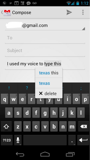 As you may have noticed earlier, I’m a big fan of Android’s deeply integrated voice features. Google hasn’t made nearly as many improvements here as I would have liked — I can’t understand why Voice Actions still offer the same feature set as when they launched over a year ago, especially when Apple’s Siri is one of the iPhone 4S’s biggest selling points. But ICS does introduce a major improvement in the way voice transcription works.
Before now entering voice input on Android has been a remarkably high pressure affair. You’d initiate it by tapping the microphone (or holding onto my ill-fated Search button), then have a few seconds to speak your mind — without any pauses. Wait too long between words, and Android would assume you’d finished.
The new version fixes this, and then some. As you start speaking, you’ll see Android start transcribing the text in near real-time. You can pause as long as you’d like before you complete a sentence. It’s hard to appreciate until you’ve used it, but it makes these voice features that much more enjoyable to use.
Also, it’s now significantly easier to modify the text after Android has transcribed it — if you’re mistranscribed, you can tap on words with grey underlines to see similar-sounding phrases that might be correct. That said, the interface for this a little is hit-or-miss (sometimes I’ll mean to tap on an incorrect word, but it’ll select a phrase, or vice versa).
The Hardware
I’ve sort of buried this section intentionally. I haven’t had the phone long enough to do any kind of battery testing, and while my brain seems to adapting to the UI reasonably quickly, my hands are apparently a bit less elastic. In other words, the device feels really… different.
The phone is huge. It is thin and very light, and it doesn’t feel bulky, per se. But I find myself doing finger gymnastics as I use it: sliding my pinkie beneath the device when I need to tap the ‘Back’ button at the bottom of the phone, then sliding it back up the side when I need to tap on the search box, which is at the top of the screen. II can’t navigate the UI without moving my hand around.
Now, I am a man blessed with fairly small hands, and I’ve been using the much-smaller Nexus One as my primary device for years now. So this difference may be more jarring to me than other people. I’ve been told to give it a few days, and there’s a decent chance I’ll get used to it. But I’m still skeptical — I’ll have more thoughts along these lines in the coming weeks.
Thankfully, the device’s giant screen has an upside: it’s a beauty to look at. Text looks fantastic. And the relatively vast screen real estate means that applications can fit in more buttons and content without feeling cramped. Oh, and remember the three software nav buttons I discussed earlier? When you’re watching a movie, those vanish entirely, which means nearly the entire front of the phone becomes a video display. It’s really nice.
And finally, there’s the matter of performance, which I’ll save for a future post as well. Usually the Galaxy Nexus hums along, but I’ve had one or two moments where where it reminded me of my Nexus One, pausing at odd moments and apparently ignoring finger taps. This hasn’t happened often — and Google says at least one of the issues I saw is a known bug that has already been fixed on devices customers will receive. So we’ll see how it performs over the coming weeks.
Here’s a video walkthrough of some of the features:
From left to right: Nexus One, Nexus S, Galaxy Nexus