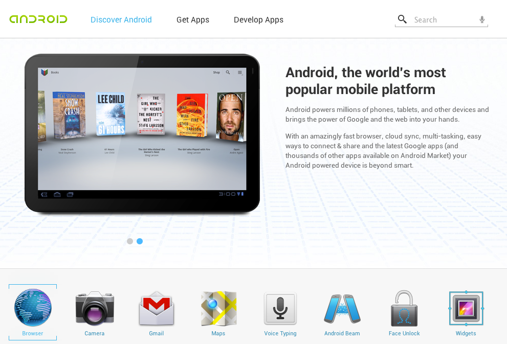
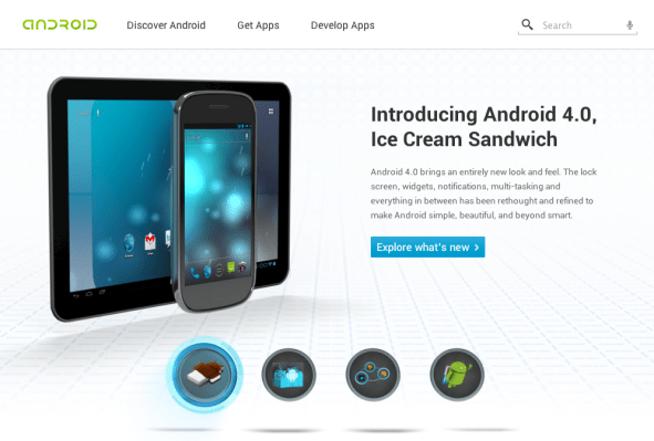
Android is growing up. The platform that began its life as something built for the anti-iPhone crowd is quickly evolving into something built for everybody. Today, Google has overhauled Android’s website to match.
For as long as I can recall, Android.com has been, for lack of a better word, dry. Primarily built as a landing pad for press, partners, and developers, it didn’t really do much of anything to sell Android. Even the one generic “Learn More!” link lead to a page full of totally not-consumer-friendly terms and phrases like “Adding SDK Components” and “API Difference Reports”. It also didn’t help that the old layout looked like something left lingering from the late 90’s.
While it still has a link or two for the stray developer, the new Android.com distills the experience down to what matters: Android. Want an overview of whats new in Android 4.0? Bam! It’s front and center. Want a deeper look into some of Android’s finer features? It’s one click away.
The new look is dramatically improved — or, if we’re going for objectivity here, dramatically more modern. There’s an obvious emphasis on big icons and plenty of white space, making the whole thing feel like a proper product page for one of the main products released by a major technology company. It’s super flashy, without the Flash™ — as far as I can tell, all of the snazzy animations and transitions are done in HTML5 and Javascript. Be sure to mouse over the handset/tablet there on the homescreen for a subtle demonstration of Google’s rock-friggin’-solid scripting talent.
Google has also built a “Get Apps” page, which highlights a handful of applications in a series of themed “bundles”, from “Getting Started With Tablet” to “Calling All Gamers”. Google can’t say Android has the most apps, so they’ve got this page pitching their market’s diversity.
Overall, it’s a huge step up.

