
Google has been awfully protective of their latest version of Android, but thanks to the folks over at RootzWiki and Android Police, we may have our first ever glimpse at Ice Cream Sandwich. As always, keep those grains of salt handy — they claim their source is solid, but there’s no guarantee this isn’t just a smartly skinned Nexus S.
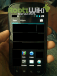
We reported a few months ago that Ice Cream Sandwich would have a revamped UI, and these images seem to confirm that statement. One thing to note right out of the gate is that it seems to be much more spaced out: the distances between app icons and their names have increased a bit, and though the change is minor, it makes the whole layout more open. This could be a hint at the hybrid phone/tablet nature that Ice Cream Sandwich is shooting for.
The notification bar is probably the biggest change, with room for bigger icons and updates. The app drawer also seems to have undergone a facelift, with different headers for apps and widgets, and an integrated link to the market for easy access. And you probably noticed the neon blue highlights; apparently Google is sticking with Tron as their design inspiration.
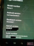


Both sites sport different changelogs, but in short, the IRK36b build packs the following:
- Brand-new launcher and app drawer interface
- Will launch with Google Shopper and support NFC-capable devices
- Gmail has been totally re-themed to match ICS (not pictured)
- Nexus S will be receiving ICS via update, but the “Nexus Prime” will be getting it first
- Mostly UI changes – many older devices should be able to run it
- The apps on the homescreen may be “stackable”
- Google search bar embedded at the top of the homescreen, a la Honeycomb
If this is in fact a fake, it’s a pretty convincing one. It’s admittedly an early build, and pixels will certainly shift between now and the release date, but it seems quite possible that Ice Cream Sandwich will ultimately look like this.