Way back in December 2007, Google began to roll out a new centralized Profile feature that allows users to establish their own public online profile, complete with a short bio and links to personal sites. They were mostly useless (you never really saw them), until 2009 when Google began incorporating them into search results (run a query for someone’s name, and their Google Profile has a good chance of popping up). Which is a nice feature, but there’s been one problem: Google profiles are just plain ugly.
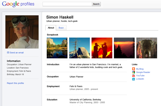
Open up a profile with the existing design and you’ll see a poorly-organized smattering of links, a bio, and maybe a map — sort of like a personal homepage someone might have set up in 1998. They’re not difficult to read, but compared to the social networks profiles we’re all used to, they’ve never felt personal or social in the slightest. But now Google is looking to change that.
In a post on the Google Social Web blog, Google has announced that it’s giving Profiles a face lift. And, judging by the photos, it looks like it’s decided to adopt an interface that’s more in line with the social networks we’re all used to — like Facebook. User photos are now more prominently seen in the upper left hand side of the page, and content is presented in a larger right column, broken up by section (employer, education, and so on).
Granted, it’s not an exact clone of Facebook — and countless sites have adopted a similar layout — but the similarity helps make the profiles feel inherently more social. And the timing isn’t a coincidence: the profiles will likely play some role in Google’s +1 social initiative, whatever form that eventually takes.