 Google has never been known for their design prowess. But over the years, there’s no denying that they’ve made even google.com look significantly better with logo, button, and even search box upgrades. Now it looks like the basic top nav bar may be getting a fresh coat of paint as well.
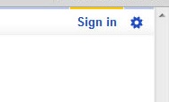
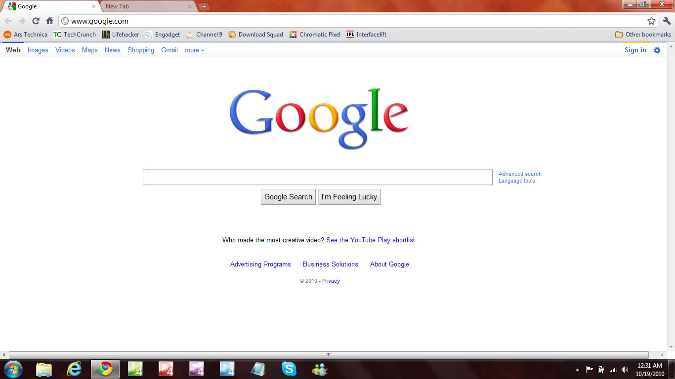
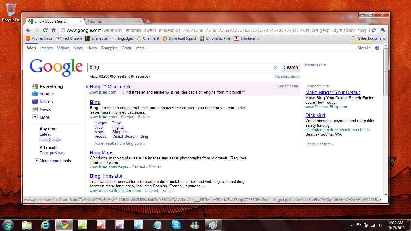
As you can see in the images below, Google is currently testing a new-look nav bar that replaces the standard blue underlined links with a much better looking, but subtle, toolbar. Your place in the navigation is now not only indicated by the darkening and bolding of the text, but also by a colorful band across the top of you position. For example, in the images you can see the blue bar on top of the “Web” area indicating you’re in a web search.
On the far right side you’ll notice a nice big “Sign in” button (with a subtle yellow bar on top of it), and a new settings icon next to that.
It’s not a huge change, but it’s a nice-looking one. Google has confirmed that they’re testing it but will only say the typical:
At any given time we are running 50-200 search experiments. You can learn more about search experiments on our blog: http://googleblog.blogspot.com/2006/04/this-is-test-this-is-only-test.html
I suspect this experiment is one that will see the light of day on google.com at some point in the future.
(Click on the images to enlarge)
New:
Old:
[thanks Ted]


