They say nothing is certain except death and taxes. And, maybe, you could be certain that no matter how many design fads come and go on the Internet, Craigslist would pretty much look the same as Craigslist has always looked. Designer types get downright pissy that the site’s design has stayed static. And makeover recommendations abound – Wired even dedicated several print pages to the idea last year.
“Craigslist is frustrating and claustrophobic,” said Matt Willey of Studio8 Design in that Wired article, who recommended pull down menus and lots of images. But Craigslist had trudged along, racking up 50 million unique visitors a month and 13.4 billion page views (Comscore, July 2010). Not bad for a site that has looked almost exactly the same for over a decade.
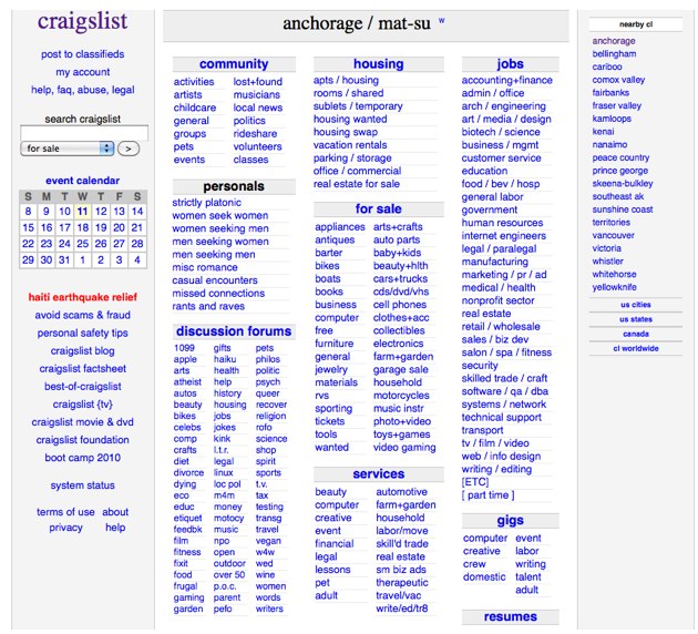
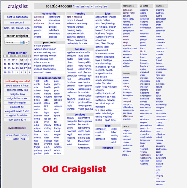
But parts of Craigslist are now sporting a somewhat updated design. It hasn’t rolled out on all of the geographic sub-sites, particularly bigger cities. But many of the smaller city sites are now showing something that’s a little different.
There are a number of small changes, like removal of the boxes around the left navigation bar items, and slightly bigger main section headers (community, personals, etc…). But the most useful change is the right sidebar, which now defaults to show other cities close to your current site. In the old design, you had to click on your state or country and then select the other area. This saves a lot of hunting and clicking.
That right side bar also uses a little JavaScript to let you toggle to see other cities, countries or worldwide instead of just the sites closest to you.
Never say never, I guess. And with the Singularity coming, perhaps the only thing we’ll soon be able to say is certain are all those taxes.
