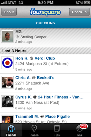
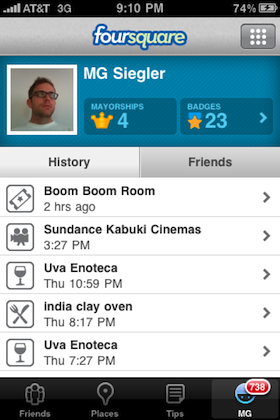
 It’s hardly a secret that all of the major location-based players are planning big updates to their services to coincide with the SXSW festival starting next week in Austin, Texas. One of them peeked out a bit early: Foursquare.
Earlier today, the latest version of Foursquare, 1.6, went live in the App Store for a brief period of time. I’ve been using the build for a couple of days, and while the functionality isn’t all that different from the previous versions, the look-and-feel has been completely revamped.
This is notable because the vast majority of Foursquare users are still using the iPhone (67%). So this update will be a welcome change for many, especially as Foursquare and Gowalla continue to compete. Gowalla, while smaller than Foursquare, is generally considered to be the prettier of the two. Certainly, with its new website revamp, Gowalla still holds that title on the web, but the new Foursquare app looks pretty nice compared to the Gowalla iPhone app now.
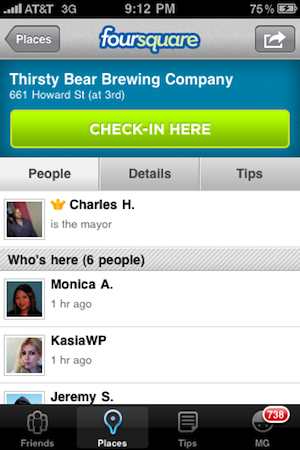
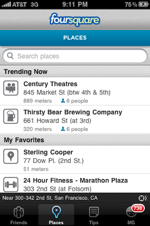
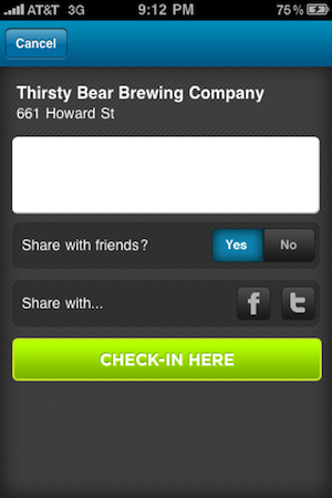
So what’s different? The entire color palette is now a mixture of silver, blue, white, and bright green. Some may not like the bright green elements, but it’s effective to let people know where to click when you want to check-in. Also new is the fact that the “Shout” button is emphasized on the upper left part of the main screen. “Shouting” is basically the equivalent of tweeting out a message, it allows you to send a message to your followers without having to check-in at a place. It’s a bit odd that this is now a main button on the left side while the “Check-in” button is on the right side (considering most people read left to right).
Another new element is the idea of categories. As we wrote about a couple of days ago, Foursquare is starting to categorize venues into certain categories. While there isn’t much you can do with these yet on the new iPhone app, you are able to see icons that represent how a venue is categorized.
Something else new that is nice is that you can click on individual venues in your friend stream to load that venue’s main screen (which now shows who is there, right away). Previously, you had to click on your friend, then click over to see the venue — so this saves time.
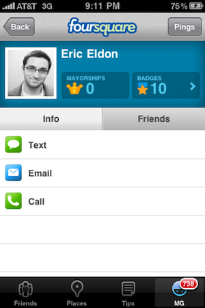
While using the app, I wondered if Apple would approve it given that it uses the text, email, and phone icons used by the iPhone itself within the app (see screenshot below), but apparently if they accidentally put it in the store today, they’re going to be okay with those icons. These icons are shown on the new profile pages, which also show how many mayorships a member as, as well as how many badges they’ve earned. Interestingly, the point-based element of the app has been depreciated a bit, as that’s how a harder-to-get-to area of the app.
As a bonus to this advanced iPhone preview that some users got today, Foursquare also launched a new version of its Android app tonight. I’ve been playing with that for a few minutes, and that seems very solid as well. Look for the new version of Foursquare iPhone app at some point late next week when SXSW starts.
